Note before reading: This is Part 2 of our interview with Heather Krause of Datassist. To make sure you get the full story, check out Part 1 here!
Data Collection Made Easy
Continuing the discussion we held last week, Heather Krause of Datassist was nice enough to give our audience more details on nonprofit data collection and visualization. As mentioned in Part 1, data can solve almost any problem your nonprofit comes up against. It can also guide any program or efforts.
It’s as simple as knowing what questions you have about your problems, programs, or people. Once you know your question, Heather says, you can start collecting data to answer those questions. You can do this internally or you can recruit an organization like Datassist to help.
If you’re at a loss for where to find data, or have never considered data collection to be an internal operation, start by looking at:
- Your tools (computers, volunteer tracking apps, etc.)
- Your people (volunteer surveys, demographics, etc.)
- Your output (events held, number of people directly helped, etc.)
- Your outcomes (results, difference made, changes found, etc.)
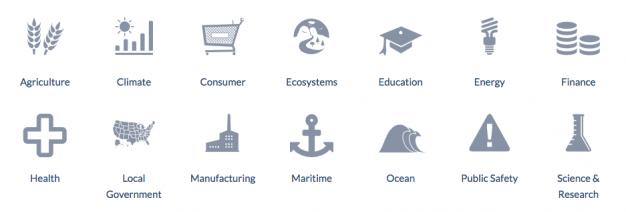
Your organization can also use open data sources for information, including Data.gov or Pew Research Center. You can combine the information you collect from these other (validated) sources with that of your own organization to get a better picture of an overall trend or issue.
Data.gov databases
Note: For more open data sources, check out this extensive list. Just make sure that you verify sources and methods to make sure they’re in line with your own data questions.
To give you an idea of what we’re talking about, here’s one example:
If you were to ask, “Should our organization target high poverty elementary schools or high poverty middle schools?” you could seek open source data from the Department of Education on poverty lines, dropout rates, cultural statistics, and more. From your own data or location, you could draw more information on specific schools and students you’d be (or are) helping.
Data collaboration makes this possible, but there are a few things you should know before using just any data you stumble across.
Best Practices of Data Collaboration
“Make sure you understand what the data really means,” Heather warns. Often, we find data that we take out of context or piece it to fit our own interpretations. If you were seeking information on high poverty schools, for instance, you could likely choose the first data sets you come across without “vetting” them to see if they fit your cause or question. We are also impartial to our own data mining efforts, assuming that any data we find is valid. Don’t fall into this trap!
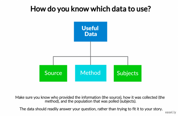
Take a look at your data, whether your own or from other sources, and make sure that your organization knows:
- The source (who provided the information)
- The method (self-reporting surveys, Census data, etc.)
- The subjects (who was included/excluded, how the poll was provided)
If all of the above are in line with your standards and/or match your own data collection methods, great! If not, re-evaluate your data collections and don’t be afraid to dig a little deeper.
When “complementary” data sets from other sources are combined to give nonprofits the whole picture, they can generate even more impact. That’s exactly what data does, when collected and used properly: increases impact.
But how do you use data once you collect it? After all, Heather says: “What you do with the data is almost as important as what the data tells you.”
Visually Sharing Your Data
Data visualization is a fairly self-evident term, meaning the process of putting information into visual form. Visuals help people comprehend data much easier, as well as absorb information much easier than through text. In the nonprofit sector, data visualization also gives you the unique opportunity to share your organization’s impact.
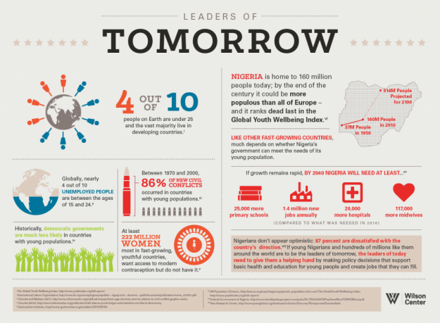
According to Max Galka, data visuals consistent of a single point of data, while an infographic is a visual that includes multiple sets of data. Take the infographic below; it is a compilation of at least 8 different data sets combined to provide a better picture of the future of countries like Nigeria. The Wilson Center created it to highlight population demands and what they need to work on in their training programs.
Image from the Wilson Center
With Easelly, you can create awesome, data-driven visuals like the one above in barely any time at all. And because your nonprofit probably has more than one juicy bit of information to share, we highly recommend infographics! But whether you use Easel.ly to highlight related data sets or you create a simple chart to embody one data set, you want to do something with that data visualization: share it!
Where to share your data visuals:
Social media
Facebook, Twitter, and Pinterest are huge platforms for data visualizations, according to Heather. It’s easy to create an infographic with Easel.ly, download it, and share it across your social media channels. Social media graphics are a huge boon to nonprofits in any sector, so don’t neglect this marketing zone.
Internal reports
Data visualizations can be used for internal reporting instead of public information. “Spending time internally with your data as a staff, as a team, can really help you understand your organization better,” Heather explains. Visualizations make it that much easier for everyone on your team to understand the trends and information the data represents.
For morale
Did you know that visuals are processed through the emotional centers in the brain? Because of this, visuals are considered more motivational and persuasive than text. Imagine how motivated your volunteers, staff, and even donors will be when they see the data represented visually to show the difference you’ve made together!
Seminars and conventions
Data visuals are becoming a go-to tool in conferences and seminars, according to Heather. It’s easy to encapsulate an idea and visualize a trend with data visualizations, and infographics are often the most common ways to share data sets. If you want to get attention at a conference or seminar, bring your infographics!
Of course, data reports, visualizations, and infographics can be used in countless other ways, from printed reports, ebooks or promotional materials, email campaigns, and even advertisements. The best part is they take minimal effort to create and can be used multiple times for different things.
What are you waiting for?
Now that you know:
- What sort of questions to ask
- Where to find the information to answer those questions
- How to share that information internally or publicly
… it’s time to get started! Your nonprofit already does great work, but you could do even more if you have a clearer picture of your target. “Even if you think you don’t have enough data to make it worth it, or you can’t find the data you need… you can work with the messy data that an average nonprofit has,” Heather assures. You can collect it, organize it, and then visualize it to motivate, validate, and direct the work your organization does (or wants to do).
If you’re not sure how to get started creating infographics with your nonprofit’s data, start here. You can also download our Crash Course in Infographics FREE e-book and look at our Complete Infographic Checklist. This way, you can create the best infographics from your nonprofit’s data!
—
Want help finding the data you need? Want help using that data correctly? Datassist can help your organization understand the impact you have on your community (and the world) by harnessing the information you already have.


