
We recently spoke to Max Galka, an entrepreneur and blogger, whose main focus is on the world of data. Galka is known across the Interwebs as a data visualization genius as well as a data pioneer, working on projects that visualize information in truly colorful ways.
His latest project, Blueshift, focuses on creating interactive, data-driven maps. He has started a number of other projects, including FOIA Mapper and Metrocosm, which emphasize the importance of data, our access to it, and how we can use it.

Easelly reached out to Max to talk about the latest trends in data and, of course, how people can use infographics to share the data they find or collect online.
His insights are helpful for anyone who trying to track data to grow their business, explore their industry, or just learn something new!
Max has such a wealth of information so we’ve split this post into two parts and we also will be following it up with a webinar. We hope you find his insights helpful – we sure did!
The Expansion of Data
We’ve always had data as human beings – in the form of our written records, books, and newspapers. But did you know that only 6 percent of all data comes from these sources?
The other 94 percent of data is all digital. It is also projected that about 90 percent of all data available has been created and stored digitally within the past 3 years, with about 2.5 quintillion bytes of data being made each and every day. Because of this, it’s easy to see why we are hearing so much about data lately, including terms like “Big Data,” data visualization, and data collection.
Not sure what “Big Data” really is, even though you’ve heard the term a lot?
Big Data is defined as “extremely large data sets that may be analyzed computationally to reveal patterns, trends, and associations, especially relating to human behavior and interactions.”
Other definitions include, “Information that can be ‘mined’ or explored to give insights into people and trends,” or “The intersection between capitalism and information.”
In essence, though, Big Data is being used to help businesses, organizers, and educators understand the world around them and put that information into practice to improve systems, processes, and sometimes even sales.
What Do We Do With Data?
Many companies, entrepreneurs, and organizations are sitting up and taking notice of Big Data and how it illustrates complex systems like the economy, buying trends, and business growth in general.
While corporations and organizations actively use data to explore their customer base, understand trends, and institute changes, data is important in virtually every arena of modern life.
Understanding health care, tracking political polls, evaluating the economy, surveying audiences, and even quantifying test scores – these are all ways of collecting data. But what do we do with data once we’ve collected it?
People like Max Galka are predominant in the field of data visualization, which gives us a way to turn complex (and sometimes boring) data into images and graphics that can be used by anyone.
Galka and other data collectors focus on creating graphics, images, and animations that make it incredibly easy for everyone to understand the data provided so that it can be used and evaluated to create change, increase engagement and, most of all, inform.
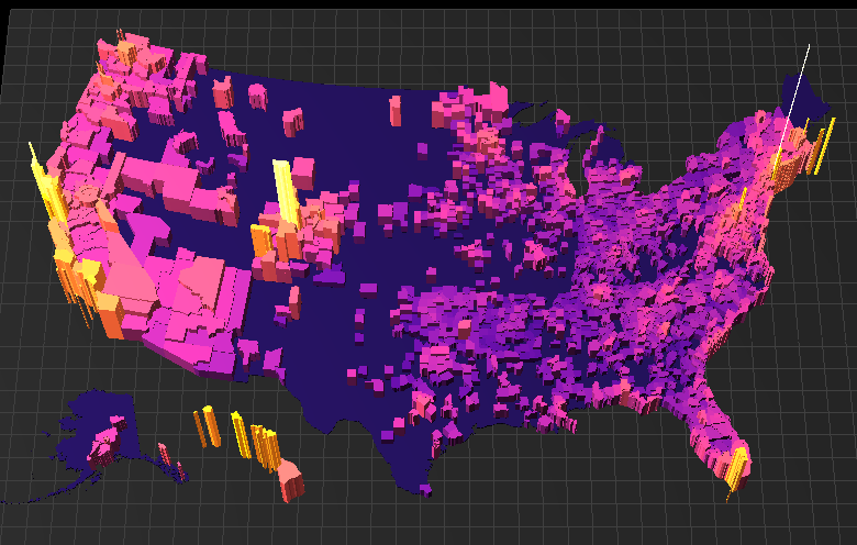
Pictured above is Galka’s interactive visualization of the cost of housing the US by state and county. While a list of average price per square footage would get the point across and probably be more simple to generate, it’s much less engaging and harder for us to comprehend in the grander scheme of things. This is a great example of what data visualization can do for an average individual – not just businesses or economists.
Visualizations vs. Infographics
Data visualizations (like Galka’s interactive maps) and infographics are on the rise every day. In fact, the number of infographics created increases by 1% every day and data visualization searches on Google have increased by 50% since 2011.
Wondering what the difference is? Galka explains:
In my view, data visualization generically refers to any graphic (map, chart, graph, etc) in any format (image, video, 3D model, etc) that communicates data. An infographic is an image that contains one or more data visualizations relating to a particular topic, often with other design components mixed in (photos, drawings, explanatory text, etc).
When Galka was asked, “Why do you think there is such an increase in the amount of data visualization we see today?” he explained:
I see two big reasons. First, the sheer amount of data available has grown exponentially over the last few years, and there is a growing need for ways of interpreting all of it. Likewise, the last few years have seen a quantum leap forward in web-based graphics technology. Most of the graphics I post would not have been possible just five years ago. The data was not available then and neither were the tools I use to visualize it.
As we’ve talked a lot about on the Easel.ly blog, visuals are becoming the most popular content on the Internet, and they help people learn faster than simply reading statistics or listening to a lecture. Visuals are King in this fast-paced, content-hungry world. But what does data visualization have to do with you, your business, or your classroom?
How You Can Visualize Your Own Data (and Why)
We can think of countless reasons to visualize data that you find or collect on your own.
Whether you’re a teacher who wants to share statistics with your students, a small business owner who wants to map your audience’s response to your latest marketing campaign, or a massive corporation tracking sales and trends in different regions, data can help. It doesn’t have to just be for personal or internal use, either. This is where data visualizations and infographics intersect.
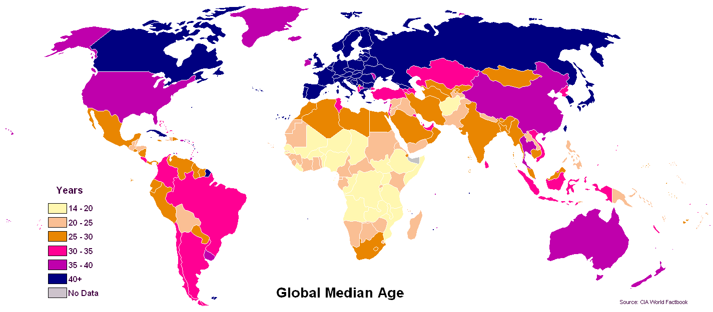
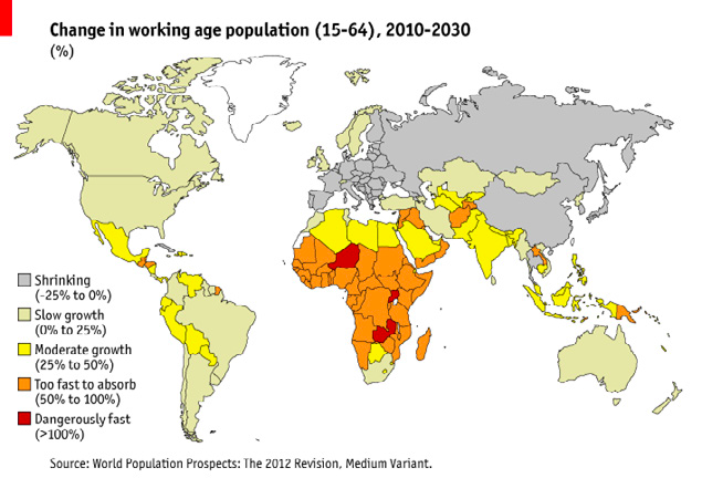
While Galka explains that data visualizations generally explore only one point of data, infographics can combine multiple data sets into a really engaging, usable infographic. Take, for example, the data visualizations below:
The world’s population 2015:

The average age across the world:
How the working age is changing:
How many people are employed across the world:
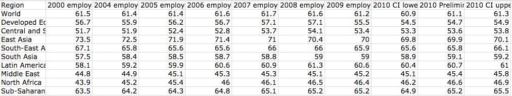
All of the data visualizations above show a single facet of data based on one specific point — the population, the average age, the average working age, and the average employment rates worldwide respectively.
Now take all that information, which may or may not appeal to you in it’s “raw” form, and put it into an infographic about the future of our world’s economy and the next generation of workers and leaders.
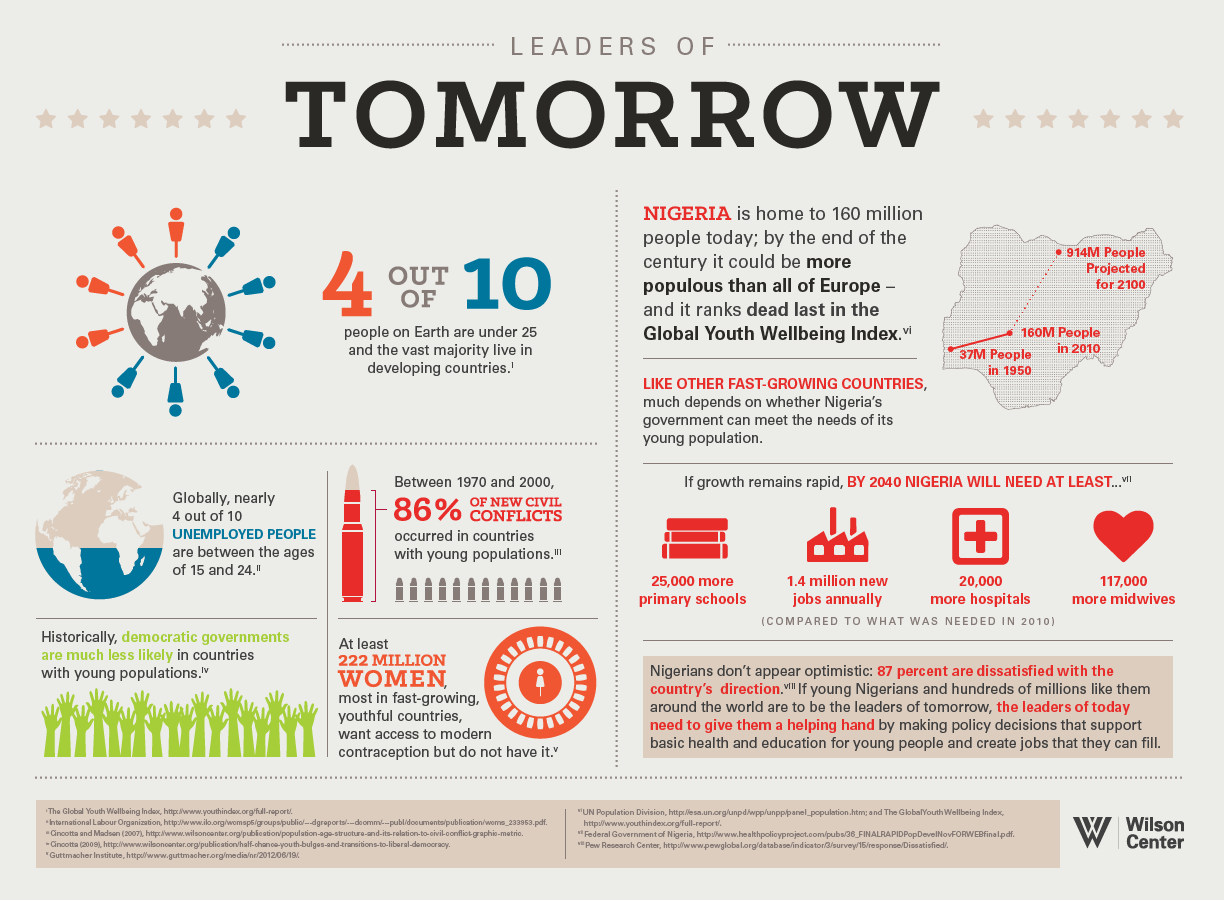
While obviously other information was inserted into the infographic above, it makes the point: data visualizations are generally created based on one “stream” of data, while infographics compile multiple streams to create a cohesive representation of the broader topic.
What Data Means To You
What does all this mean for you, your classroom, your business, or your nonprofit organization?
It means that you should jump on the bandwagon already!
Collect data, whether from online resources or from your own samples, testing, and/or surveys. Create singular data visualizations like Max Galka’s, or create infographics that explain your subject, your product, or your campaign in cohesive, data-based findings.
Visuals are consumed more than any other type of content online – you can write about your poll findings or the latest statistics in your field all you want, but people want to see them. Visuals are 67 percent more persuasive than words alone, and they trigger the emotional centers of the brain better than the other senses.
This means that your audience is going to learn more from you, be persuaded to “convert” (if you’re a business), and also trust you more.
In a nutshell, if you want to make a point with the facts while also appealing to your audience – whoever that is – start visualizing data today.
Are you wondering how to even find or collect data, or how to make a visual representation of what you find? Stay tuned for Part 2 of our interview with Max Galka!
As a quick recap, Max discussed the differences between data Visualizations and infographics. And while they are more similar than they are different, they both require you to collect data and information!
Depending on your goal and the information you are trying to share, he suggested 5 places to start when looking to collect data:
- Public Data
- Website Analytics
- Social Media Reports
- Polls, Surveys, and Sales Data
- Libraries
He also provided some tips on getting started with Data Analysis:
- Check if source is reliable (and attribute it properly!)
- Vet the conclusions you’re drawing from the data
- Correlation does not imply causation
- Let the data speak for itself
While there are many tools out there that will allow you to create Data Visualizations and Infographics, he gave us a preview to Blueshift which is an easy way to design and publish dynamic maps in minutes.
Visit Blueshift to sign-up for early access! We also appreciated Max’s opinion on Easelly as an easy-to-use tool to create aesthetically pleasing infographics!
Additional Resources:
- Webinar Slides (View Only)
- Information, Visuals, and Collecting Data: An Interview With Max Galka (Part 1)
- How to Collect Your Own Data: An Interview With Max Galka (Part 2)
- Step-by-Step Guide to Making Infographics from Scratch (guide)
- Infographics for Your Classroom (eBook)
- YouTube – Infographic Design Tips and Tutorials
Max Galka Resources:
- http://metrocosm.com/
- https://blueshift.io/
- https://foiamapper.com/
- Data Visualization Resources & Learning Tools
Easelly would like to extend a big THANK YOU to Max for taking the time to talk with us and I hope you found it informative!