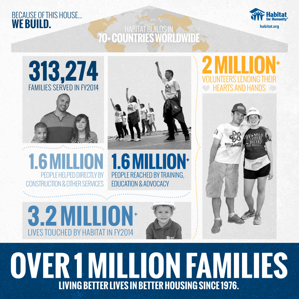
There are times when visuals just speak louder than words. Whether it’s a picture of people being helped or a colorful chart showing the total amount of funds raised, visuals have always struck a chord. Nonprofits and relief organizations have always known this, which is why their promotional and marketing materials usually have photos of the people they have helped (like the image below).
But even with visuals, the biggest problems nonprofits consistently face are:
- Getting their message out there and
- Growing their outreach, their impact, and their access to resources.
With #givingtuesday just around the corner (November 29), many NPOs are gearing up their marketing campaigns to spread the word and hopefully increase their impact on the world. But still, they struggle with how best to spread the word and gain traction for their cause. How do they know what will work best in their marketing and outreach efforts?
With the growing access to data (information) and data mining tools, nonprofits have a wealth of knowledge to help them – more than ever before. This data could tell them who to reach out to, what areas they are excelling in, and where they want to grow. But how do nonprofits utilize this data to be seen by the community at large? After all, you don’t want to just share numbers and small bits of boring facts – you want to hit your audience, the public, where they live.
The good news is that, when nonprofits start using data (and infographics to represent that data), they can translate their own collections of data into visuals that impact their community. From there, the community will respond to their message, engage with the organization, and spread the word.
Where Data and Visuals Collide
Nonprofits, just like any organization, are walking mines of data. From your employees, your volunteers, the number of people or families you’ve helped, the amount of money raised, to where you see the most engagement on social media – these are all sources of information that can help grow your organization.
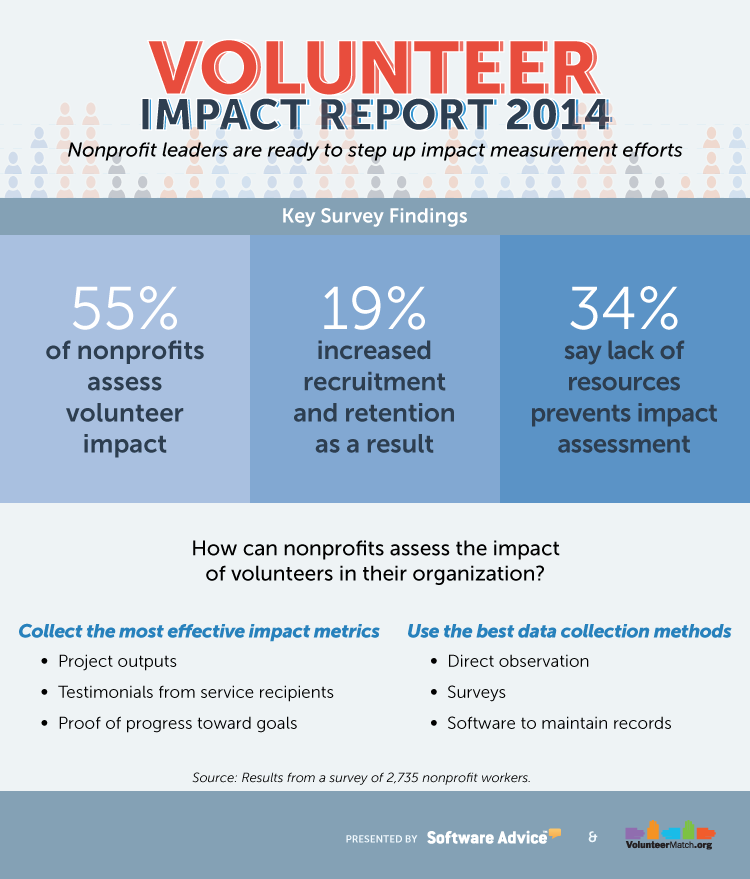
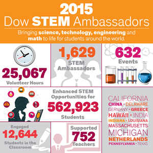
The beauty of data is that it usually helps you solve a problem you’ve been working on for some time. Nonprofits have a handful of problems across the board, like needing more volunteers, needing more exposure, or wanting to share their impact to raise more funds. Below are a handful of ways to solve these problems with data, as well as examples of how other organizations have created infographics to help them expand their operations.
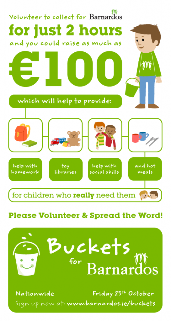
Do you need more volunteers?
85 percent of nonprofits run on just volunteers alone, which makes it a lot easier to understand why nonprofits are always in need of more volunteer help. If you’re a nonprofit hoping to gain more volunteers and support, look to your data!
Look at your current volunteer base: are they working enough hours? Where do they put in the most time? Are they being recognized for their efforts? Where did you find them? You may be thinking, “Great! That helps me recruit more volunteers, but what does that have to do with visuals?”
Simply take the data you’ve gathered about your volunteers and think about all the content you could make to encourage more volunteers to sign up. You could:
Showcase the impact your volunteers have had
Highlight how many hours your volunteers have put in
Share what makes your volunteers great
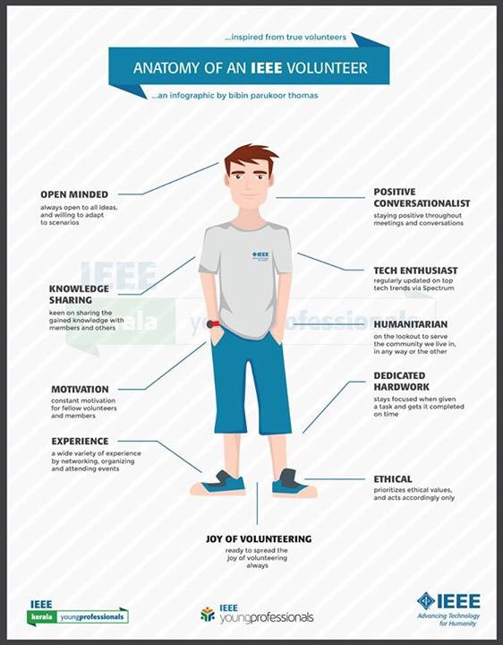
Highlight how easy it is to get involved
Do you want to highlight what your nonprofit does?
Sometimes, it’s hard to limit the impact your organization does to a simple few sentences in a grant proposal. Even harder still is to show why your NPO does what it does.
With the right data, you can tell the story of your nonprofit:
Wh you’re helping (age, location, gender, socioeconomic status, etc)
How you’re helping your demographic (donations, shelters, relief aid, mentoring, etc.
The difference your NPO has made

Do you want people to spread the word of your nonprofit?
If you haven’t noticed yet, the data these nonprofits collected and then combined into their own infographics can effectively kill two birds with one stone: these data visualizations serve as content marketing, social media content, and even print media material. This visual content can then be used by your organization, by your audience, and can spread awareness online and in your community.
Kinda magical, huh?