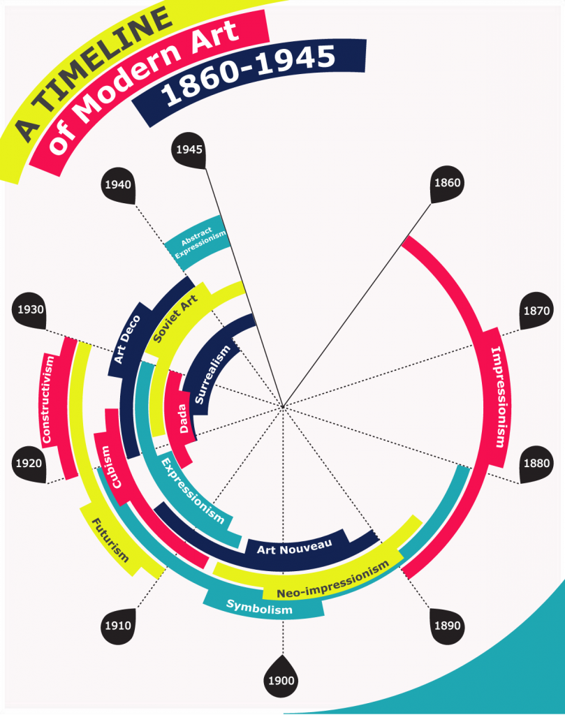
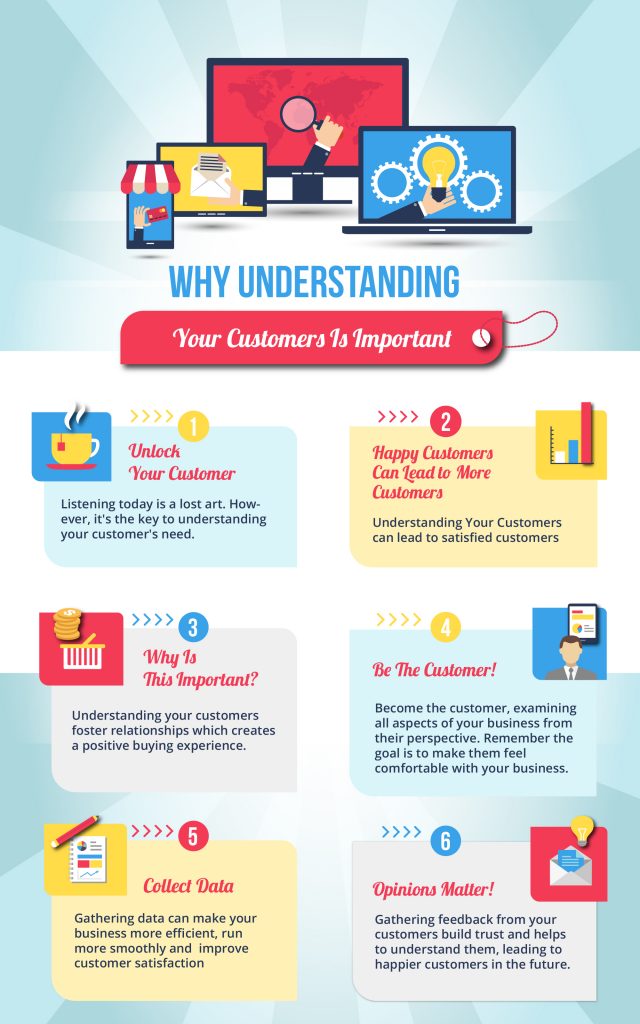
Step 1: Create a beautiful, insightful infographic that begs to be shared.
Step 2: Build links, drive traffic.
Step 3: Everyone knows about your brand! Success!
Sounds like the perfect plan, right?
But even if you create the most amazing infographic ever, this isn’t going to work as a marketing strategy unless people connect it with your brand. Creating the perfect on-brand infographic takes more than slapping your logo onto the image and calling it a day. But a little forethought can go a long way.
Here’s our checklist designed to ensure that your infographic is on brand and ready to work for you.
Figure out what you want people to remember
Don’t make the mistake of thinking an interesting bit of data is the same thing as a great piece of content. You need to take that data and build a story around it: What do you want people to remember from that story? How are you going to tell it to them in a compelling manner?
Before you start translating statistics into visualizations, make a plan. Figure out the conclusion you want your reader to make about your data, and about your brand, and build everything else around that. Choose which kinds of graphs, illustrations, or charts would most effectively make your points.
Choose colors intentionally
Every designer does this in their own way, but here are some general tips to remember:
- 2 main colors are ideal, 4 colors total is the max in most cases. Less really is more.
- 1 or 2 of those colors will be the main colors. The others will serve as accents, creating an occasional pop or (if a neutral) helping achieve balance and directing the eye.
- If you feel a pull to use more colors, try using shades of existing colors instead of bringing in completely new ones.
- Retain plenty of white space. (Note this doesn’t literally have to be white… but make sure your design has room to breathe.)
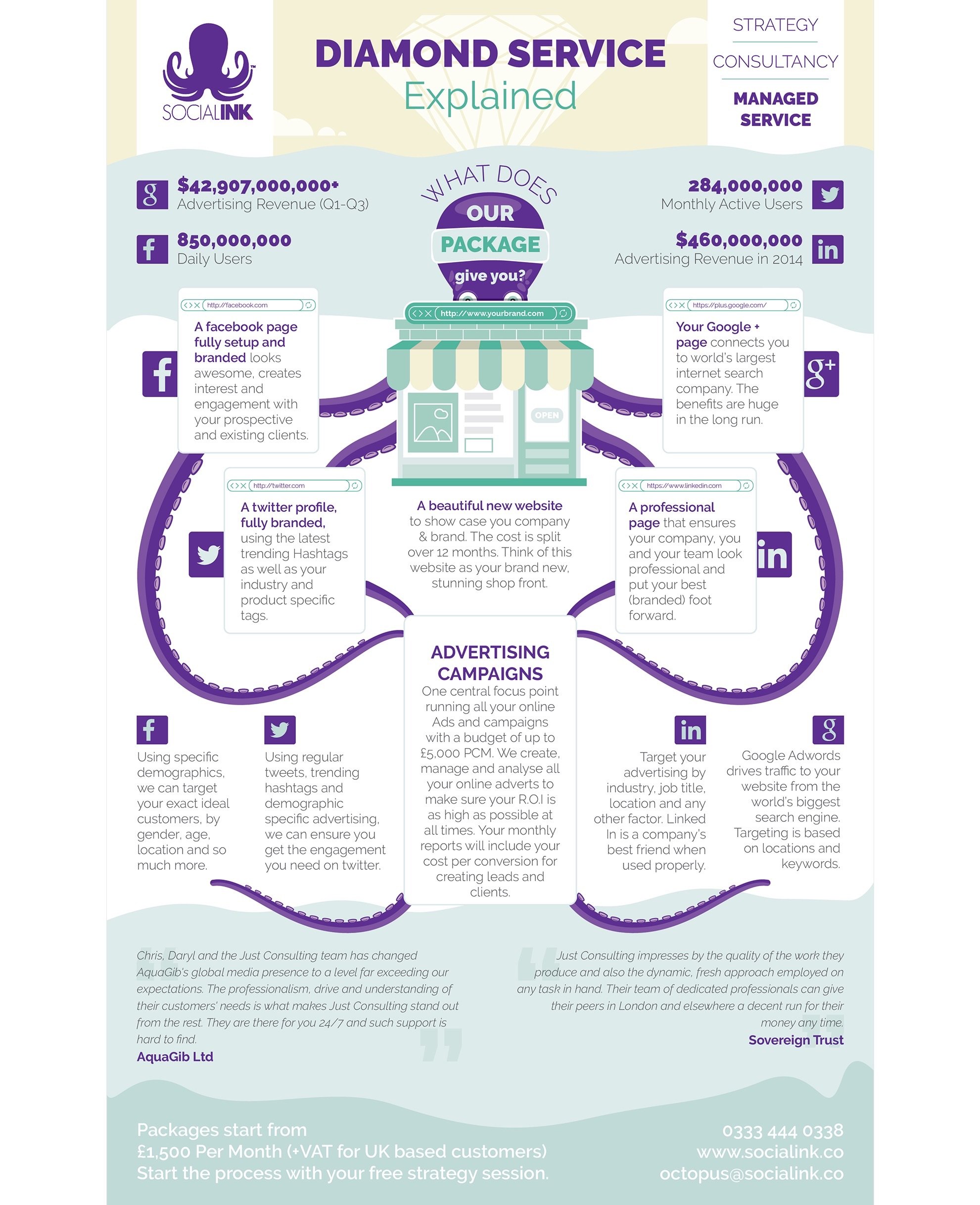
As you choose your color scheme:
- Consider your company’s branding colors. Unless there’s a very specific reason not to, you should probably consider those as the main colors for the design.
- Think about your subject and your audience. Maybe your brand colors are blue and black. But if you’re talking about green business solutions, you might want to figure out how to green the design up (literally).
- Look to the natural world for color inspiration when you’re talking about something seasonal, outdoorsy, or otherwise related to the planet.
Build a visual structure
Make sure each piece of your infographic works towards together to communicate your message:
Title: Should be five words or less. It should immediately tell your audience what they’ll learn if they spend the time to read it. This isn’t the place to get fancy and clever.
Introduction: If you choose to include a written introduction, it should be concise and draw the reader in. Make sure no one needs to read past two sentences to be hooked or to know what the infographic is about or how it relates to your brand and product.
Subheadings: Make these guideposts that carry your reader through your infographic. These are like mini titles, so keep them under five words and make sure they’re highly descriptive.
Chart and icon labels: Label icons, charts, and other visuals. Make sure you run the infographic by at least one person not familiar with the data before publishing—they can tell you if everything makes sense and has enough context.
Main story: Focus on the graphs and visual representations of data. These are what infographics are all about, so make sure you have plenty of them and they are the focal point of the infographic. Make sure the visual style of the graphs matches your branding.
Sources: Don’t forget these; a simple link is usually enough.
Branding: Your logo shouldn’t be intrusive, but it should be clearly visible in the header or footer of the image to drive the brand message home. Not only do you want everyone to remember your name, but branding your infographic with your logo also ensures that yours is a trusted piece of content from a reputable organization.
Turn text into graphics
Anytime you can transform dry data and the text version of your brand’s value proposition into graphics, do it! Especially if you’re a writer, it might be your impulse to keep a lot of text, but don’t. Making your information visual grabs your viewers’ attention and holds on. It also communicates your brand message viscerally and instantly.
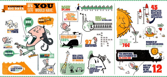
Get a great design
Great design that’s beautiful and dynamic is your best chance of an infographic going viral. Keep your design simple. Use color and space to attract the eye, and don’t make the infographic too busy. Highlight your critical data points visually.
Write compelling copy
You might think content in an infographic doesn’t matter as much, but actually just the opposite is true. You need to squeeze at least as much impact out of far less content, and use it to make your visuals come to life with meaning. Trim everything you can; your goal is ultra-lean content and great, shareable sound bites. Think of this as your visual elevator pitch about the brand.
Make your data emotional
The best infographics convey both data and emotion—they hit readers in the mind and the gut instantly. Show people what you’re saying in a way that conjures up a reaction – emotional responses lead to more effective conversions! Remember, every impact will be tied back to your logo and brand colors with a simple glance based on these checkpoints.
Use appropriate fonts
Smart font choices make a huge difference for your infographics. Choose readable fonts that work well together, and avoid fonts that are silly, childish, or too frilly or fancy. Also make sure that any fonts you choose translate well on mobile; some purchased fonts do not resize properly based on screen size.
No one should question your credibility because of your fonts, or need extra time to decipher them. Avoid more than two font styles in one infographic. And most important: make sure the fonts you choose harmonize with your existing marketing materials and logo so your reader gets a sense that it all “fits” together.
Build visual flow
Your infographic shouldn’t look choppy, like you glued a series of images and bits of text together. It should flow like one coherent piece. There is more than one way to draw the eyes through an infographic, but in general, keep the informational order clear and use shapes that pull your eyes into the right spots so your brand message is clearly delivered.
Include a call to action
Remember, always include a call to action in your infographic. Why are you creating it—what do you want people who read it to do? And what does that have to do with your brand?
The bottom line
Infographics tell a story with charts, data, illustrations, photos, colors, icons, and text. Make sure that story is backed up by a well-branded infographic that links your awesome work to your awesome company!
Get started with your own brand infographic by choosing from our business infographic template collection.
—-
Kelly Morr is the senior manager of content strategy at 99designs. She likes writing stuff, making stuff, coming up with far-fetched ideas, figure skating and cuddling her two cats. You can reach her on Twitter @kelmo.
