These days, most people go to the internet to learn almost anything under the sun.
Even when looking for information on products and services, people will quickly turn to YouTube tutorial videos, Facebook recommendations, and search engines to find answers.
One new way people learn about a company’s products and services is through a knowledge base —one exhaustive resource of information and answers to queries that gives users an A to Z guide to a business and its offerings.
Why is a knowledge base important?
As more people switch to an eCommerce lifestyle, customers now clamor for faster and more efficient support. For instance, 31 percent of customers expect to find help instantly when researching a product or service. Moreover, 40 percent will expect answers to their queries within five minutes.
Of course, this response time isn’t always attainable with a chat support system. For this reason, more companies are building comprehensive knowledge bases to answer client queries faster.
Knowledge bases also serve as an effective way to support existing customers who get stuck with a product’s features, benefits, and interface.
7 tips to making effective knowledge base content
In recent times, companies have started looking into knowledge base content to inform, educate, and even delight their customers.
Here are a few tips to remember if you’re planning to build a helpful, effective knowledge base.
1. Use simple and clear icons and illustrations.
Did you know that visual content has been shown to increase employee productivity?
Visuals like icons, photos, and illustrations are a powerful way to get people to understand and retain information better.
When using graphics in your knowledge base, remember to use simple and clear icons and illustrations.

An icon that isn’t relevant to the corresponding content will most likely throw people off instead of guide them better.
Creating graphics for your knowledge base will need some graphic editor, so you might want to try looking through different examples of graphic design software solutions.
2. Make use of infographics.
Using infographics in your knowledge base can help a lot as well.
When making infographics, the wonderful news is that there’s a huge chance you won’t have to start from scratch.
Creating an infographic takes much time and work. But thanks to today’s technology, you can use an infographic template, so you don’t have to start from scratch. You can also use various stock icons and images to save time when creating visuals.
Another way to use templates is to subscribe to an infographic-creation service that often comes with an array of ready-made templates to help you get started on your infographic knowledge base. One great example of this is the infographic-creator tool like Easelly, which has a library of infographics for business, non-profit, school, and learning use.
3. Think like a customer.
When building a knowledge base for your customer, it helps to put yourself in their shoes.
Ask yourself questions like, “how would I feel if I had problems understanding a service or feature?” or “If I didn’t have the technical background, would this part make sense to me?”
Most of the time, a customer will come into your knowledge base already with questions and frustrations.
Make sure that your knowledge base will diffuse and not fuse their feelings of frustration all the more.
It also helps that writers and client experience managers remove any form of bias when mapping out the content and form of their knowledge bases.
Always assume that your reader doesn’t have the same level of understanding of the product or service as you. Provide links to supporting content and documents if needed or even include a video tutorial.
4. Select a viewer-friendly color palette.
Another critical factor when designing effective knowledge bases is your choice of colors.
A recent study shows that learners are 39 percent more likely to remember the message when looking at a colored instructional material than a black and white one.
Colors help fire up queues, invoke emotional responses, and keep a natural flow in your knowledge base.
It’s also important to learn how to choose the right color combinations.
Choose colors that complement or match each other. Make use of a maximum of two to three bold colors. Any additional colors present should only be accenting and should be a relative shade of your primary colors.
5. Keep your text short and sweet.
The core of any good knowledge base content is indeed copywriting. However, many people are allergic to text-heavy content.
Keep the text short and sweet when creating your website’s knowledge base. Make use of bullet points when able and avoid using run-off sentences that go for miles before the next stop.
You can also use online tools to improve your text’s readability, like the Hemingway App or Grammarly.
6. Stay visually consistent.
Many businesses make the mistake of merely creating graphics, websites, or even knowledge bases for the sake of having them. But creating anything that represents your brand, company, or service also needs to match a consistent and visually appealing brand guide.
A knowledge base template works best with a visual brand identity that matches all your other company collaterals and content.
Ensure that the fonts you use, photography, language, tone, color schemes, and other factors are consistent with your brand elements and knowledge base.
7. Maintain a flow.
Like any masterfully told story, any other form of information design and dissemination work best with a flow and outline in mind.
Since the goal of a knowledge base is to clarify things for users and customers, it helps make sure that the content maintain a certain flow or format when explaining a concept, feature, benefit, or service.
Map out your knowledge base’s text content before laying it out into a fully functional web-based knowledge base to ensure that the contents flow and match well.
Keep your thoughts organized and retain a particular structure when offering information. Using an example to illustrate specific use case scenarios or answers to frequently asked questions helps a lot.
3 knowledge base examples that are easy to understand
If you’re looking for inspiration to help you visualize your website or company’s knowledge base, check out these fantastic examples that provide a good starting point.
Hubspot Academy

Extremely exhaustive and makes use of good flow. The colors, graphics, and tone also match the whole Hubspot brand flawlessly.
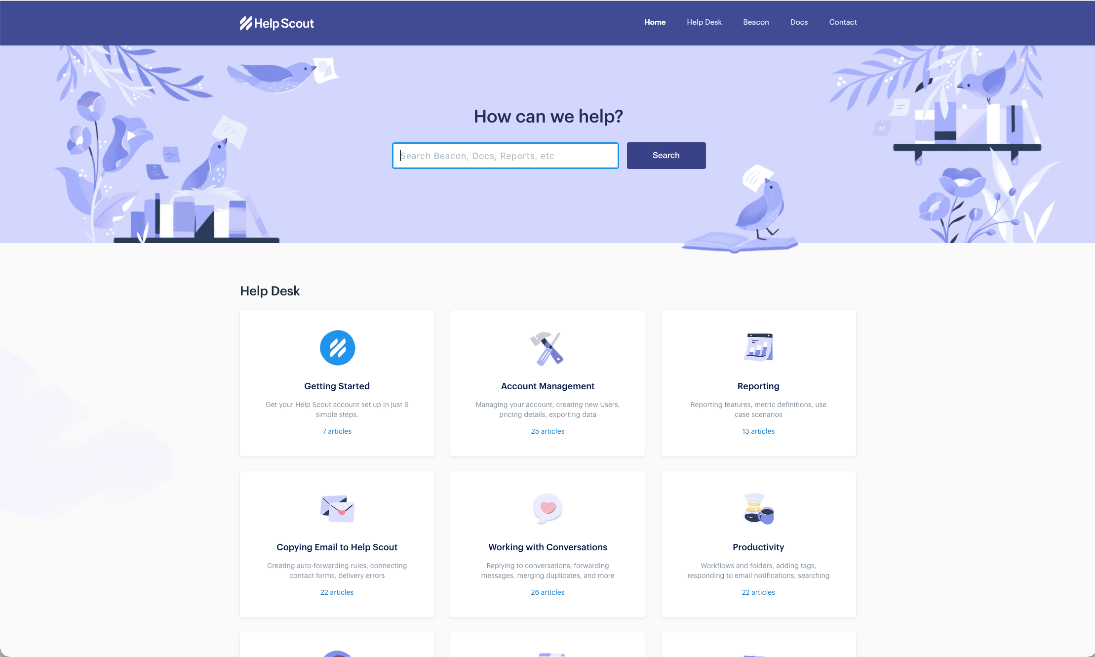
Helpscout

The knowledge base of this helpdesk software starts with a short yet succinct question on how they can help. The stunning visuals are also a plus!
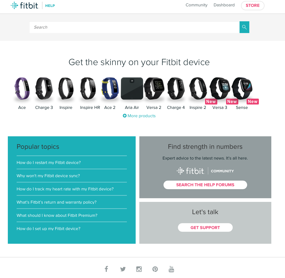
Fitbit

The site categozies the content and queries based on products, making it easier to navigate.
Make your knowledge base visual
When educating and informing potential or existing customers, the level at which you communicate directly affects the trust and relationship you’ll build with them in the long term.
Visual tools like infographics used in functional services like a custom knowledge base will help strengthen that trust and develop their lifetime value many times over.
Ready to add more visuals to your knowledge base content?
Take a peek at our infographic template collection or improve your design chops with infographic video tutorials.
Editor’s note: This blog post was written in collaboration with Finances Online, a business software discovery and research platform.
