The Ultimate Guide To Signage
Signage is a vital part of the world of marketing. There are very few forms of marketing that are more personal to your company or business. A good sign helps you stand out from your competition, tells your customers and patrons what you’re all about and helps get your message across in ways other mediums just can’t!

But where do you even start? Something so important obviously requires a herculean amount of effort, right? A sign is an investment and needs to match your brand identity. However, it’s surprising just how easy it is to get a high quality sign for your business. In fact you could pass all your branding needs on to our design team for a fraction of the cost of hiring freelancers and graphic designers and we’ll handle all your branding needs!
But we’re getting ahead of ourselves. Here’s a complete breakdown of all of the ins and outs of signage. As it’s a project we offer as part of our unlimited graphic design service, we feel we’re in a great position to guide you through this topic. Read on for more information on the history of signs, their uses, costs and applications!
What is Signage
Put simply, signage is the design and usage of signs in order to communicate your brand or message. There are many different forms and materials used in the world of sign design. However the main purpose of signage is to convey a message or communicate information to assist the viewer of the sign in vision making.
The History of Signage
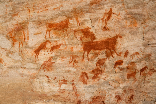
Technically we could say that signs have been around almost as long as there have been people. As signs are pretty much visual graphics used for the display of information, it could be argued we’ve been using signs since at least 18,000 BC. Paleolithic cave paintings showing animals, people and scenery could very well be described as the first signs used by early humans.
Modern signage can trace its roots to antiquity. If you were to jump in a time machine and head back to Rome in the republic era or any of the great Ancient Greek cities you would find recognisable signs for all sorts of businesses and public works.
Early Romans made signs using wood or terracotta. Usually you could find these on shop fronts as well as to announce events and news to the public. Many signs from antiquity have survived into modern times in some form or another. The white and red bar of the barber shop and the three balls marking pawnbrokers are still used around the world today.
In the east, signs advertising brands, products and shops were common. Copper presses for producing advertising posters for sewing needles have been found in China dating to the Song Dynasty.
Fast forwarding to the medieval period we can see signs becoming more and more a part of daily life. Laws as early as the 14th Century meant that taverns in England would have to display signage noting their sale of alcohol. As towns and cities grew in size all over Europe, competing manufacturers began to make signs and banners to differentiate themselves from their competitors. Sometimes a merchant would adopt a well known local animal, figure or place for their banner. Alternatively they would make their signs a clever play on their name; for example a stone house for the name Steinhouse.
As the overall goal was to attract attention these signs were often elaborate works of art. Everything from the design to the supports that held up the sign were intricate works of art. A sign was a huge investment in these early days of advertising and an integral and recognisable part of your livelihood.
With the adoption of horses and carts in most major cities, large signs became a bit of a nuisance. However Tavern signs continued to be prominent and many of the great artists of the 18th and 17th centuries were known for their sign painting.
With the industrial revolution came the joys of mass production. Nowadays signs are everywhere. From the humble sandwich board to massive neon and electrical boards on buildings it’s hard to escape them. Signage in the modern world has grown to be far more complex than its humble origins would have predicted. However the basic premise has stayed the same, and many of the design principles hold true to this day.
Types of Sign
We could spend hundreds of hours and pages going through all of the variations and uses of signs. However you probably wouldn’t want to read all of that and we definitely wouldn’t want to write it! There are however 5 key types of sign that the average journeyman sign designer should know about before starting.
Navigation Signs – These can be found inside or outside, usually used for finding your way around shops, tourist attractions or businesses.
Identification Signs – These signs are used to indicate facilities and services. Think toilet or parking lot signs you might see that draw your attention to needed areas.
Information – Provision – These signs will show you some information about services and businesses. These can be maps, directories and the like. You can find them in museums, shopping malls and attractions
Persuasion – Promotional signs which are intended to persuade its readers to consider a promotion, product, business or brand.
Safety Signs – Think those yellow slippery floor signs. These are big, garish danger signs with rules and pictograms to keep you on your toes around dangerous areas and objects.
Common Signage Materials and their Uses
The guide below will give you a good baseline for any form of sign you can think of. However there is a consideration we haven’t mentioned, materials!
Please note that there are countless varieties of wood, plastic and metal out there and this guide won’t cover all of them. We’ve picked the 5 most common material categories to give you a broad overview. Using this you should be able to narrow down the base material category you need and then work from there to decide on what specific kind of plastic, glass, metal etc. you would like to use for your sign.
- Wood – Wood has been used in the making of signs for millenia. When it’s done right it is beautiful but it does require considerable upkeep. It’s also one of the most expensive methods out there as you’ll need a fairly capable craftsman. Wood signs can be durable and pretty and they only get better as the wood ages. Wooden signs work great for nature walks, forests and businesses with a bit more of a rustic feel or location.
- Plastic – As there are more varieties of plastic out there than we care to count we will have to be general with this one. Generally speaking plastic is durable and long lasting. It’s extremely versatile and a good cheap option. Plastic is a great choice if you need something quick, cheap and easy. However we would encourage you to look further and examine some of the complexities of the material.
- Glass – Glass is another common option we see in signs frequently. Brittle and hard, glass signs have many applications and when done right they can be extremely effective. It lacks the versatility and durability of other materials but is great for a precise and high end look.
- Metal – There are of course degrees and variations to this category. However metal signs are generally the favourite for outdoor use. They are heavy duty and usually low maintenance. Perfect for outdoor signs and not overly expensive to buy or maintain
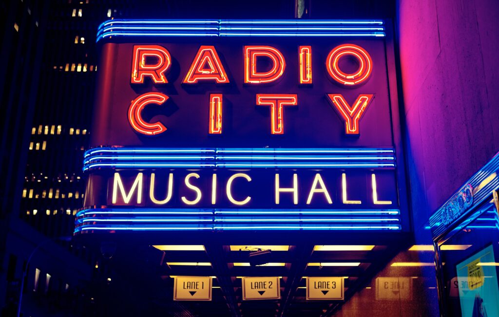
- Neon – Neon signs are luminous gas discharge tubes. They can keep your message going 24 hours a day and give you a really cool, retro look. They are however expensive and running costs should be figured into this.
Step by Step Guide to Designing your Sign
If you decide to give making your own sign a go then we’re here to support you! Whilst it may seem as simple as plastering your message on to a board and hanging it out your window, this couldn’t be further from the truth. Careful thought and consideration needs to go into each step of the journey. Here’s a guide our own designers stick to when designing a sign. Follow the steps below for a comprehensive list of the do’s and don’ts of designing a sign.
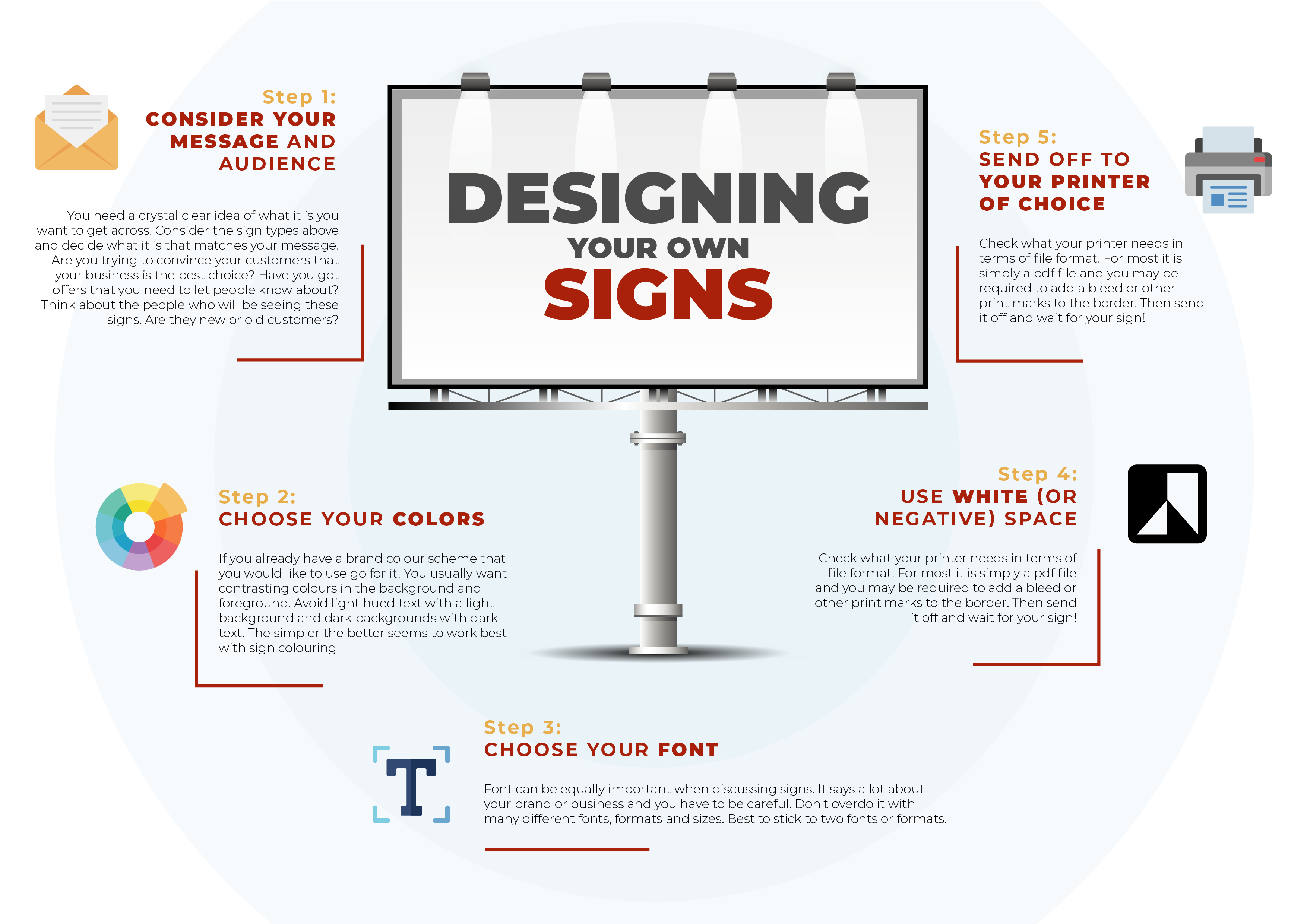
Step 1: Consider your Message and Audience
It should be an obvious one but you need a crystal clear idea of what it is you want to get across. Consider the sign types above and decide what it is that matches your message. Are you trying to convince your customers that your business is the best choice? Have you got offers that you need to let people know about? Spend a good amount of time brainstorming and really nailing down your message before you get started on the next steps. It will really help keep your project focussed.
Once you have that down, try and think about the people who will be seeing these signs. Are they tried and true customers who have been with your business from the offset? Or is it a new audience who have never heard of you or your service before? These are important considerations. You want to get your brand identity across but you don’t want to overload the sign with information your viewers may already know, or not care about.
Step 2: Choose your Colors
We’ve written several really high quality blogs about the science and psychology behind color choice in design but we’ll condense it for you. Obviously if you already have a brand colour scheme that you would like to use then you should absolutely go for it. One of the main principles to remember however is contrasting colours in the background and foreground. Avoid light hued text with a light background and dark backgrounds with dark text. The simpler the better seems to work best with sign colouring but for more info read the full guide here.
A command of color theory and the psychology of colors is one of the many aspects that separates a professional graphic designer from an amateur. This is a step you definitely don’t want to skimp on.
Step 3: Choose your Font
Font can be equally important when discussing signs. It says a lot about your brand or business and you have to be careful. Too garish and you’ll put people off, too simple and it can all meld into one big blur of information. It’s important to not overdo it with many different fonts, formats and sizes. Best to stick to two fonts or formats. One attention grabbing, bold font for the headline information. This is the copy that’s going to grab people’s attention and draw them into reading the rest of the sign. You will also need a slightly smaller, more plain font for any additional information that is secondary to the main meat of the sign.
Step 4: Use White (or Negative) Space
It has been proven that adverts and signs with too much text and imagery will actively deter audiences. Your eyes need rest and blank space helps to grab and direct your viewers attention to the important parts of your sign. It may not seem like an important step but learning how to correctly utilise blank spaces is vital. It helps your sign look cleaner, more professional and most importantly it works.
Step 5: Send off to your printer of choice
So you’ve made a beautiful sign design. Now what? How do we get from here to a physical piece of advertising for your business? It’s really simple. First you should always check what your printer needs in terms of file format. For most it is simply a pdf file and you may be required to add a bleed or other print marks to the border. After that it’s a matter of waiting!
How much does it cost to get a Sign Designed professionally?
So you’ve had a good look at the guides, spent hours trying to come up with a design and it just isn’t working. Don’t panic, there are hundreds of companies out there who will be able to offer you design services for a sign. But how much will it cost? Honestly it depends on where you ask. We contacted dozens of companies of different sizes and came up with this rough guide for pricing. Please note this is for a basic sign, 1600×600 cm.
Freelancer – Between $30 and $70, on average $40. This usually includes one round of revisions and a 4 day turnaround
Large Chain Company – Between $60 and $200, on average $110. These are the large print and design companies you come around. Often a 48 hour turnaround and two rounds of revisions
Bespoke Local Designers – Between $125 and $200. Usually about $2-$3 per design hour. These are specialist design companies with a lot of experience and can be pricey. Turnaround varies dramatically but you can usually forget about free revisions with companies like this
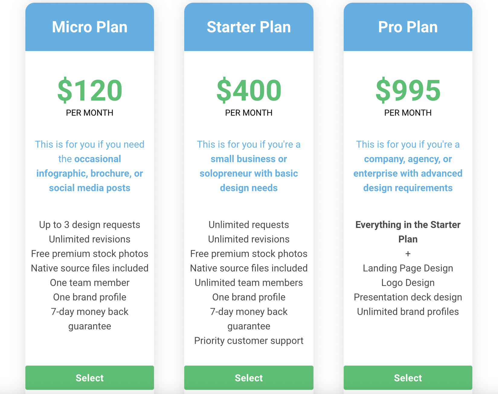
But what about Easelly? – You’ve read our blog, it makes sense we’d want to shout about our design costs. With plans starting at just $120 per month you can get a team of award winning designers working on all your design needs for you. Lightning fast turnaround times and unlimited design revisions. What more could you possibly want? Give it a try risk free today!
How to write a Design Brief for a Sign
If you have decided to make the step and hire a designer it helps to know the best ways to write a design brief. It’s a skill that needs work and can be the difference between a cookie cutter sign and an ultra bespoke sign that encapsulates your company ethos and ideas.
- Start off with a brief overview of your business. This gives the designer an idea of your background and ethos.
- Give an overview of the project. What size do you need the sign to be? Where will it be hung and what kind of sign is it?
- Information! What information does the sign need to have? Send over your copy and call to action that absolutely needs to be on the sign!
- Let us know your target audience. If you don’t have a set target audience that’s fine too! But it can be helpful to keep this in mind
- Tell us the goals of the sign. We need to know your plans and what outcomes you want to see from this sign to help us focus the project.
It can also be helpful to include a color scheme if you have one and references of signs you like and would like us to take inspiration from.
Once you’ve finished this guide you’re ready to go! Whether you want to try creating your own design with our design tool or ask our team of award winning designers to make a design up for you, you now have everything you need for a successful sign. If you have any questions, concerns or comments we’d love to hear them. Reach out to us by email and our team will be happy to help
