What is the first thing you notice about an infographic? Odds are you are attracted to the color and shapes more so than the actual text on the image. Visuals are preferred over text by most content consumers, but infographic creators still benefit from 3x more engagement on their social media and websites.
So what is it about infographics that appeal to visually-inclined consumers? Many experts believe it’s the scale (or order) of font. Our eyes are attracted to subjects that have a clear “order” and that are not shaped like traditional, generic font. Consumers also enjoy font that has a personality, but that is not hard to read.
How to find the right fonts for your infographic
It may be hard to find the middle ground between:
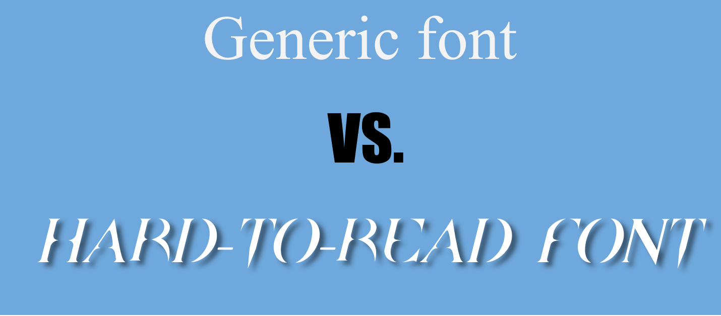
Luckily, there are a few ways you can toe this line.
1. Use your style guide.
If you’ve had a graphic designer create your logo or design your website, you’ve already got your fonts selected! This is great news. If you didn’t use a graphic designer, you still have an “unofficial style guide” that you used to create your own logo or website – simply use those fonts!
While you may be tempted to try on a new font or set of fonts in every infographic you create, fonts have a massive impact on your brand identity. If you are just starting up or don’t have strong branding yet, working within the “confines” of your style guide fonts can help your audience see your brand at work out in the wild. Once you gain more of a following, you can explore more fonts and styles.
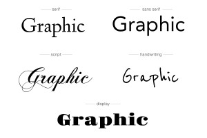
2. Mix it up with typefaces.
Within the fonts you’ve got listed in your style guide (or have used in your own branding) are “typefaces,” or subsets of that font. This is why we have Arial, Arial Black, Arial Narrow, etc. To create awesome, graded text boxes in your infographic, feel free to explore the use of these typefaces. They are all designed to work together without looking too similar, which helps users see a logical delineation (separation) of the text.
Wondering how to get different typefaces in Easelly?
A basic account does not allow you to use many different types of font, but for only $4 per month you can upgrade to a pro account. Not only do you get more fonts, but you can upload your own fonts and typefaces to use in all of your infographics!
This means you’re not limited to a few fonts and you can use any typography you like! Pretty neat, huh?
To learn how to do this step-by-step, read more here.
3. Use only two or three different fonts.
This is crucial: Many users try to use a different font for each section or text box of their infographic and the result is generally unappealing:
To avoid this mistake, we recommend that you find two to three fonts that operate as your “infographic font set” moving forward. They can be members of the same typeface, or they can be complementary to one another.
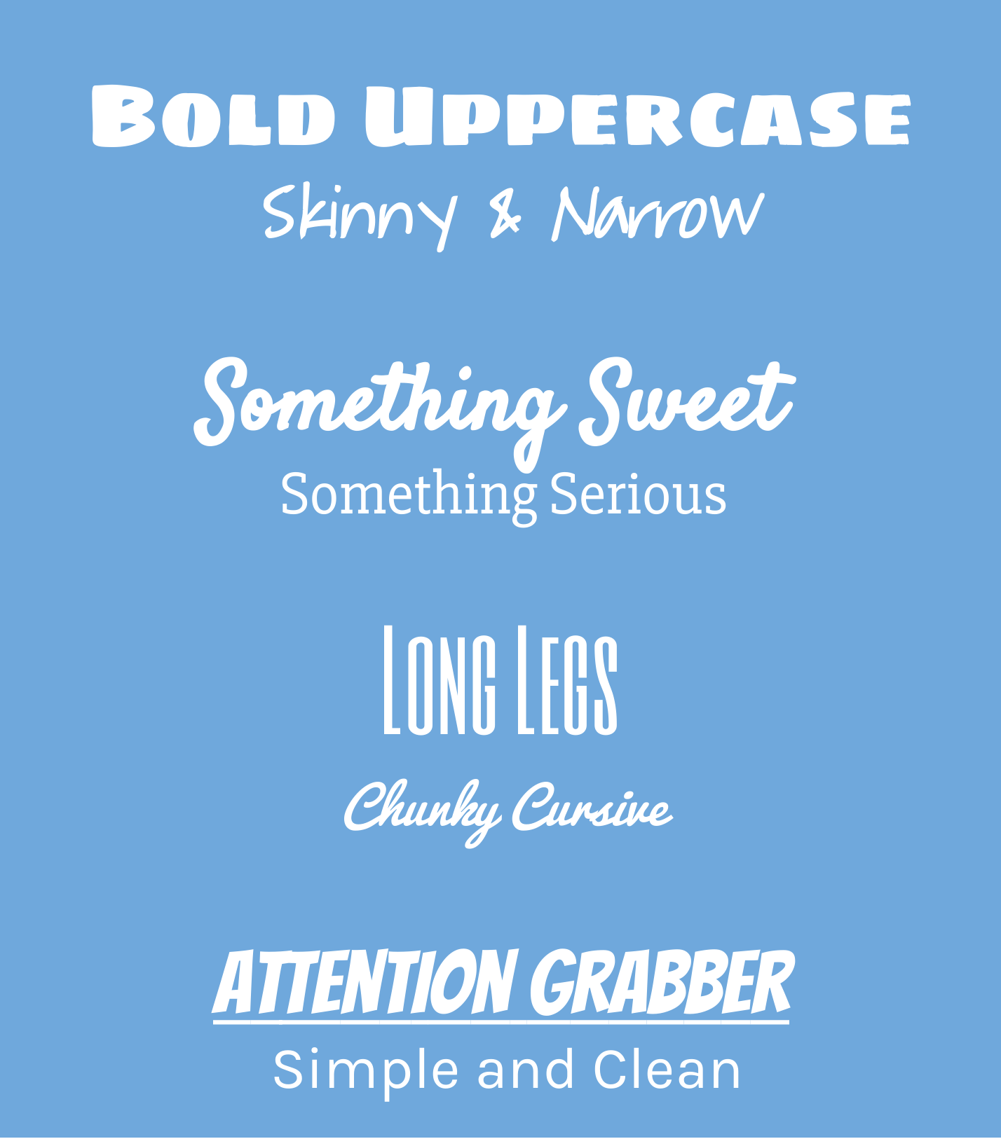
Typography, the style and appearance of text, is an art unto itself. Thankfully, there are many resources out there that can help. To boil it down, though, you want to mix bold display fonts with thinner, more simple fonts.
Here are just a few ways you can mix and match Easel.ly provided fonts to create dynamic visuals that engage and educate:
While this is hardly the end-all-be-all of the typography discussion, hopefully this technical tidbit helps you get started today on creating infographics that are beautiful and intelligently designed.
If you have any questions about fonts, typography, or design with your Easel.ly infographic creations, leave a comment below. You can also share your images with us on Twitter, Facebook, or Instagram!
Also, here’s a GREAT typography guide created by Evan Brown at DesignMantic. Thanks for the great info, Evan!
![[INFOGRAPHIC]: The 10 Commandments of Typography](https://www.designmantic.com/blog/wp-content/uploads/2014/04/font-infography.jpg "[INFOGRAPHIC]: The 10 Commandments of Typography")
via Designmantic.com