You’ve finally taken that bold step towards ramping up your visual content marketing efforts.
This time around, you’re ready to get started with infographic creation.
But you have several nagging questions in mind.
How do you ensure that you are creating and sharing high-quality infographics? Is your infographic content even going to make an impact?
4 steps to making useful, relevant infographic content
While you may think you need to fill your website, social media, or emails with infographic content, it’s also important to consider quality over quantity.
Do you want your blog readers, social media followers, or email subscribers to start avoiding your content because it’s not relevant? Or because it’s not unique?
You don’t want to be that brand or business who churns out infographics and visual content to get it out there without really caring about whether or not anyone wants to see it.
This is the pit that many infographic creators fell into in recent years— creating for the sake of creating, instead of focusing on their target audience and content goals.
Even if you’re guilty of this yourself, it’s time to take a good hard look at your plans.
Stick around to learn the ins and outs of creating useful, relevant infographic content.
Step 1: Determine the usefulness of your infographic
Before you start downloading half-baked infographics to share on your blog, we recommend brainstorming infographic ideas with your team. If you’re a one-person marketing team, list down your ideas on a piece of paper or notepad.
The core of determining usefulness in an infographic is knowing that it will work for the people it is designed for.
How do you do this?
Find out what works in your niche, with your target audience, and what kind of information you’re going to be sharing in your infographic. Watch the video below or use the following guide questions.
Guide questions:
- What infographics are other influencers or brands in your industry sharing? Do they use JPEGs, PDFs, video? Where do they share these infographics?
- What is the community/industry response to infographics similar to your ideas? Do they get shared a lot? Do people say they’re downloading or bookmarking them? Do people want new or more specific information?
- Is your audience explicitly asking for information, explanations, breakdowns, etc.?
- Is there data in your industry or business that your consumers will want to know?
- Is there something that you, as a consumer in your industry, would want to see?
- Can your infographic be used? Is there information your audience can act on? Do you have a call-to-action statement in your infographic?
All of these questions will help you whittle down those ideas that “seem good” but will not make your audience click, share, or download your infographic.
Step 2: Find out if your infographic is relevant to your audience
In the previous step, we analyzed your audience and their use of your content, and now we’re going to see if your content is current, time-sensitive, and trending.
Guide questions:
- What sort of infographics “go viral” on your social media circles?
- What sort of data are you frequently exposed to/have access to?
- Does anyone use infographics in the way you’re planning? If so, what can you learn from them? If not, research other people in different industries who do – learn from them.
- What is trending right now that can be related to your infographic idea? i.e., market trends, pop culture references, holidays. We recommend Google Trends and Twitter to find trending topics!
While you want to create content that is evergreen, it’s ideal that you plan your content calendar around significant events, holidays, and trending information so that people can find your graphics when they search!
People tend to follow trends, so don’t miss this opportunity to get the spotlight.
Essentially, the relevance of your infographic boils down to these three factors:
- Will it drive traffic?
- Will people see it?
- Will they want to click on it?
From this point, you can see whether or not the half-formed ideas you had floating around your brain will make an impact. If they do, that’s great!
In a nutshell, you can draw inspiration from:
- Your previous content that got a lot of attention (shares, conversions, etc.).
- A blog post from a site you enjoy
- Data you’ve stumbled across
- Trends you’ve noticed in your industry
- What your audience is saying they want to see
Next, it’s time to start creating your infographics.
If you’re totally new to this game and have no idea where to start, we recommend our step-by-step guide to making infographics from scratch.
Step 3: Mind your design
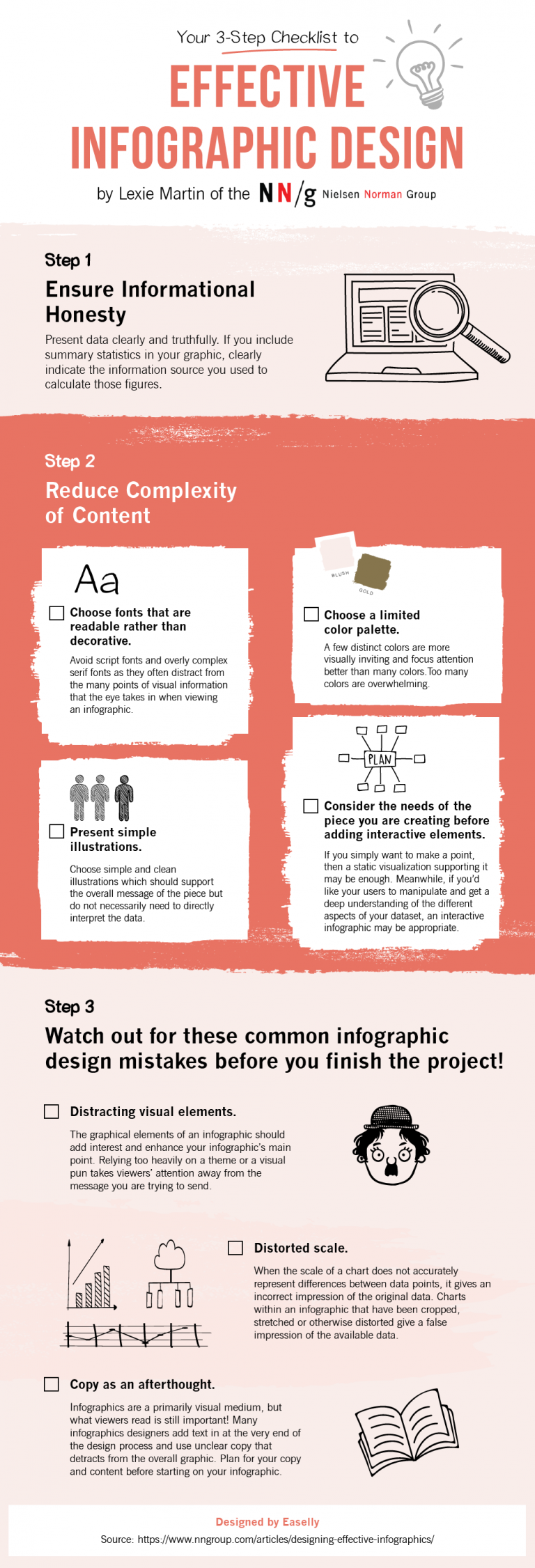
For the sake of brevity, a high-quality infographic’s design boils down to these four points that are also advocated by the Nielsen Norman Group:
- Choose fonts that are readable rather than decorative. Avoid script fonts and overly complicated serif fonts as they can distract the audience from the essential points of your infographic.
- Choose a limited color palette as too many colors can be overwhelming. Use this guide to picking the perfect color combination for your infographics.
- Present simple illustrations. Experiment with pictograms in your infographics.
- Consider the needs of the piece you are creating before adding interactive elements.
To help you along the way, we made this effective infographic design checklist that you can download.
Step 4: Envision your infographic creation outcomes
The next and final component of creating valuable content is knowing what sort of results you want to gain from your infographics.
A lot of times, we create content and think, “Yeah, they’re gonna love it!” but we don’t know the exact metrics behind that statement.
What do you want your audience to do with your infographic? What sort of conversion rates are you expecting? Are you expecting a boost in sales? Or a spike in website traffic?
The key to getting results is knowing what kind of results you want.
Guide questions:
What results do I want from my infographic on:
- Websites
- Outreach / client work / connections
- Sales / profits / leads
- Print ads (if you use them)
What am I going to do if I don’t get those results?
- Recreate the content
- Improve SEO
- Share more in places that saw results, less in areas that didn’t
- Create new content to replace it
How am I analyzing the benefit to my business?
- Unfortunately, Facebook likes and Twitter followers don’t make your business a success – sales and profits do.
- Do you have pay-per-click ads with your infographic to generate income?
- Are you creating infographics for clients (for a fee)?
- Is your content going viral and resulting in more sales as a result?
The Takeaway
To recap, you should be able to assess your infographic’s:
- Useability
- Relevance
- Design
- Results
Without all four of these components getting the “all clear” from your assessment, you need to go back to the drawing board.
Once you get used to this process, you’ll be able to make your infographic useful based on prior experience with this checklist!
Don’t get discouraged by the amount of forethought your content requires – it is SO worth it in the end. We hope this content creation guide has helped you develop more robust, more useful infographic ideas that you can use to grow your business.
Finally, we’ve got your back if you need help with your infographics, whether you’re starting from scratch or would like to use pre-made infographic templates.
You can use our simple infographic maker tool or hire one of our infographic design pros for custom infographics and animated infographics.
Recommendations for further reading:
- Definitive Guide: Using Infographics to Improve Your Website Authority and Rankings
- Image SEO Tips for Small Business and Startups
- Your 3-Step Checklist to Effective Infographic Design with Examples
*Editor’s Note: This post was originally written on January 6, 2017 by Latasha Doyle and updated on February 27, 2020 by Kai Tomboc for accuracy and comprehensiveness.


