Do you find yourself wishing that you could learn Japanese to understand your favorite anime without reading subtitles? Or do you wish you were more fluent in Mandarin to better communicate with your Chinese clients? How about learning how to pronounce Irish phrases because you love how they sound?
Whatever the reason, many of us have “Learn a new language” on our bucket list or to-do list. Of course, learning a new language is quite difficult, but it’s National Foreign Language Week so we thought it’d be a great time to introduce a few of our favorite language infographics.
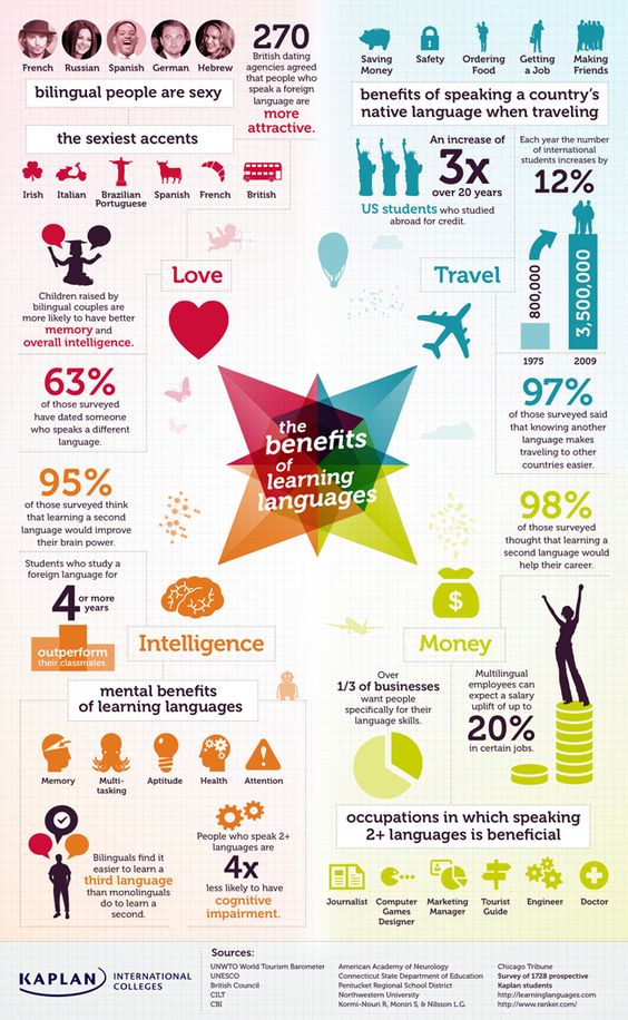
Benefits of learning language infographic
First, this infographic colorfully represents the benefits of learning languages. It highlights four important aspects – intelligence, travel, love and money. In addition, there are actually mental benefits to learning new languages, such as an increase in aptitude, memory and attention. This language infographic also shows the benefits that multilingual employees have.
Children speaking foreign languages infographic
This language infographic will give you more reasons to enroll your child in a foreign language class. Did you know that two-thirds of children around the world are already brought up to be bilingual or multilingual? In addition, children who learn to speak 2 or more languages have improved math, reading and writing skills. Most of them even have higher IQs.

Learning a new language online infographic
While most of us lead very busy lives, this infographic shows why we should use digital tools to help us learn that language we’ve always wanted to learn. This infographic shows just how much language learning has changed. From phone apps to curriculum-based software, you can learn new languages while on-the-go and at your own pace!

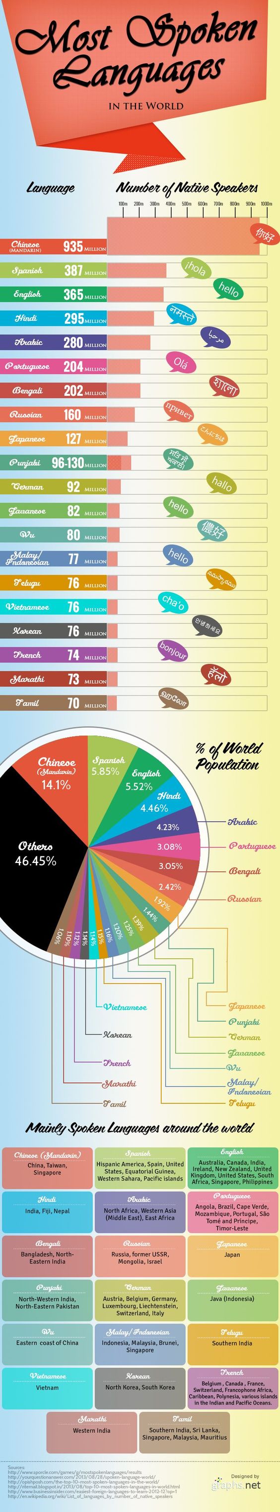
The most spoken languages infographic
Get introduced to the most common languages people speak in this spoken languages infographic. This fun and informative infographic wonderfully fuses bar and pie graphs with interesting details of which countries used the most spoken languages and the percentage of people who actually speak them. We had no idea that Mandarin was the most commonly spoken language!
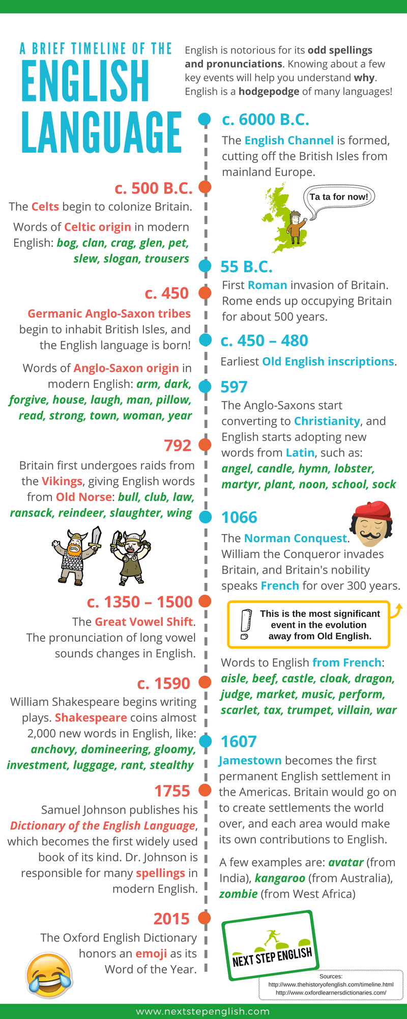
English language infographic
Check out this English Language infographic, which brilliantly explains how different conquering nations, civilizations and development influenced the creation of English. From Shakespeare in 1590 to Samuel Johnson publishing the Dictionary of the English Language to “emoji” winning the Word of the Year in 2015, this infographic covers it all.
How to say I love you in different languages infographic
Of course, one of the world’s most important sentences, and one of the most romantic, is “I love you.” This I love you infographic will teach us the many ways of saying “I love you” all over the world. From Greek’s “S’agapo” to the Spanish phrase, “Te Amo,” this eye-catching infographic also includes info Valentine’s Day – the Day of Love.

Language learning can be both intimidating and time-consuming, but now that language courses are available digitally, we now have better opportunities to learn about different cultures in addition to personal growth and development. We hope that the above-mentioned visually-entertaining language learning infographics have somehow helped you to take that language course you’ve been planning for months! Viel Glück!
Meanwhile, get started with your own language infographic by customizing infographic templates.