
Technology and education go hand-in-hand, with teachers and schools incorporating new tools and software every year. With the introduction of new tech, however, comes concerns about comprehension, data literacy, and critical thinking.
Kristin Fontichiaro and Angie Oehrli from the University of Michigan are working to address concerns about data literacy and high school students. They were nice enough to chat with Easel.ly about the data literacy project they instituted in 2015, which ends later this year. They also shared a few ideas on how Easelly education users can improve curriculum and data literacy skills in their schools and classes.
Their 2-year-long project focuses on the importance of data, students’ comprehension of said data, and their use of visuals and software. Their project, called Supporting Librarians in Adding Data Literacy Skills to Information Literacy Instruction, was started because, as Fontichiaro said, “Many students are either making poor decisions about the quality of statistics, data, and related visualizations, or they lack the ability to comprehend these resources altogether.”
By understanding where data literacy is lacking in schools and classrooms, Fontichiaro and Oehrli hope to provide resources to librarians, teachers, and school districts. Their work could help support a generation of data-literate students.
What is data literacy?
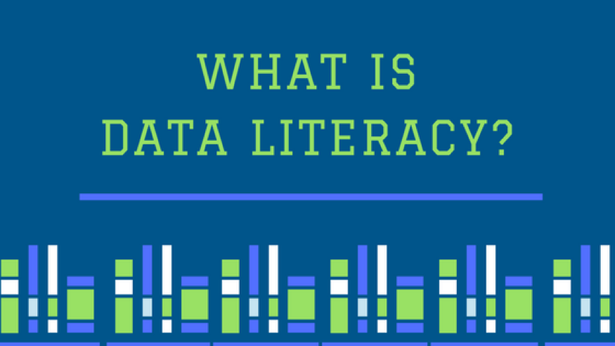
For many educators, data literacy is a standard used to evaluate how well a student comprehends quantitative data such as statistics or graphics he/she is learning or sharing. According to Wikipedia, data literacy is “the ability to read, create, and communicate data as information.”
Data literacy skills can include:
- Understanding information the data represents
- Reading graphs, charts, and visualizations
- Thinking critically about sources, accuracy, and/or methods
- Identifying filtered, persuasive, or subjective data
- Evaluating impact the data has on a question, topic, trend, etc.
In today’s classrooms, we are seeing more technology (databases, infographic creation tools, presentation software, etc.) but less understanding of the information acquired and shared. If a student needs to use digital tools to share information, it’s important that they exhibit data literacy skills, rather than just technological aptitude.
That’s where Fontichiaro & Oehrli’s project steps in.
The Project
Fontichiaro and Oehrli saw that some librarians and educators were uncomfortable navigating data, instead preferring text. They believed that identifying and sharing high-impact strategies could support librarians, educators, and school districts as they work to better incorporate data literacy into high schools. During their two-year project, they are partnering with experts in high school curriculum well as others who are skilled in data, statistics, and data visualization, to create books, webinars, and professional development materials that address six key areas in which students may encounter or use quantitative data:
- Fundamentals of data and statistical practice, including the vocabulary of data
- How data is used to inform or support claims and arguments and how to identify weak and strong arguments
- Creating and comprehending data visualizations
- Recognizing and navigating the landscape of Big Data, including citizen science as a pro-social approach to large datasets
- Being aware and proactive about personal data management, such as social media “likes” and data collected via wearables
- Recognizing the importance of ethical guidelines in one’s personal behavior and in others
Their materials will inform curriculum and training for educators and librarians to accommodate the increased need for data literacy. Fontichiaro explains that
Data literacy has always been important… we’ve always found that students struggle with evaluating information in general. Sometimes, though, in attempts to visualize or deposit information, [students] lose context. What we wanted to do with the project is help librarians help teachers and students think deeply about the context around their information and infographics.
With new educational technology (like Easel.ly), visualizing information can sometimes come at the cost of understanding. Oehrli adds that librarians want to help educators and students understand their data and visuals: “It’s not just about creating [infographics], but digesting them, as well.”
Unfortunately, says Kristin and Angie, infographics are often just created without thinking about the larger implicit argument or persuasive message.
The Trouble with Infographics
During our discussion, they shared that infographics are often a source of trouble for critical thinking and comprehension. “Our early findings show that infographics are where the need for data literacy is emerging most strongly among educators,” Kristin shares.
She added, “Infographics aren’t a requirement of the curriculum; they are a teacher’s choice to present information in a way that is more novel.” But if introducing novel ideas leads to lower comprehension and less skillful interpretation of the information, those tools are not useful.
So often at Easelly, we see people making infographics that are simply data thrown onto a canvas; we want to see that change. We want student and teacher users to evaluate the information they use, understand the story it tells, and to absorb the information.
Infographics cater to visual learning, but they don’t magically result in knowledge. A visual is processed 60,000 times faster than written text alone, but you still have to consider the information before you “dump” it into your infographic.
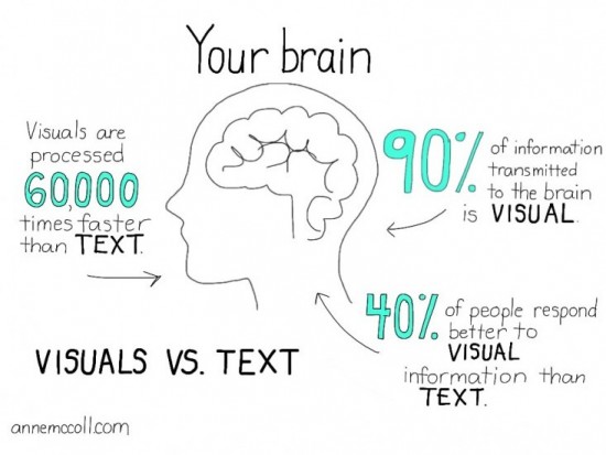
Image via Anne McColl
Between Creation and Comprehension
Thanks to their investigations and combined knowledge, Fontichiaro and Oehrli shared their insight into reversing this trend, both for schools and our users here at Easel.ly. They explained that the most common denominator in their studies is time; students and educators need time with data before they can absorb it.
“Between information and software, there is a need to insert time to discuss what those numbers mean,” explains Kristin, referencing the work of teammate Connie Williams. Students and teachers alike tend to transfer their information to software, but don’t understand the importance of the information (or don’t take the time to do so).
So how can educators fix this?
Fontichiaro quotes their teammate Debbie Abilock when she says, “Insert some friction in the middle – some evaluation of that information – and you’ll see visuals that look great but are also high quality.” By building in this time in the curriculum, the connection between software, information, and comprehension can improve visual learning and data literacy for students.
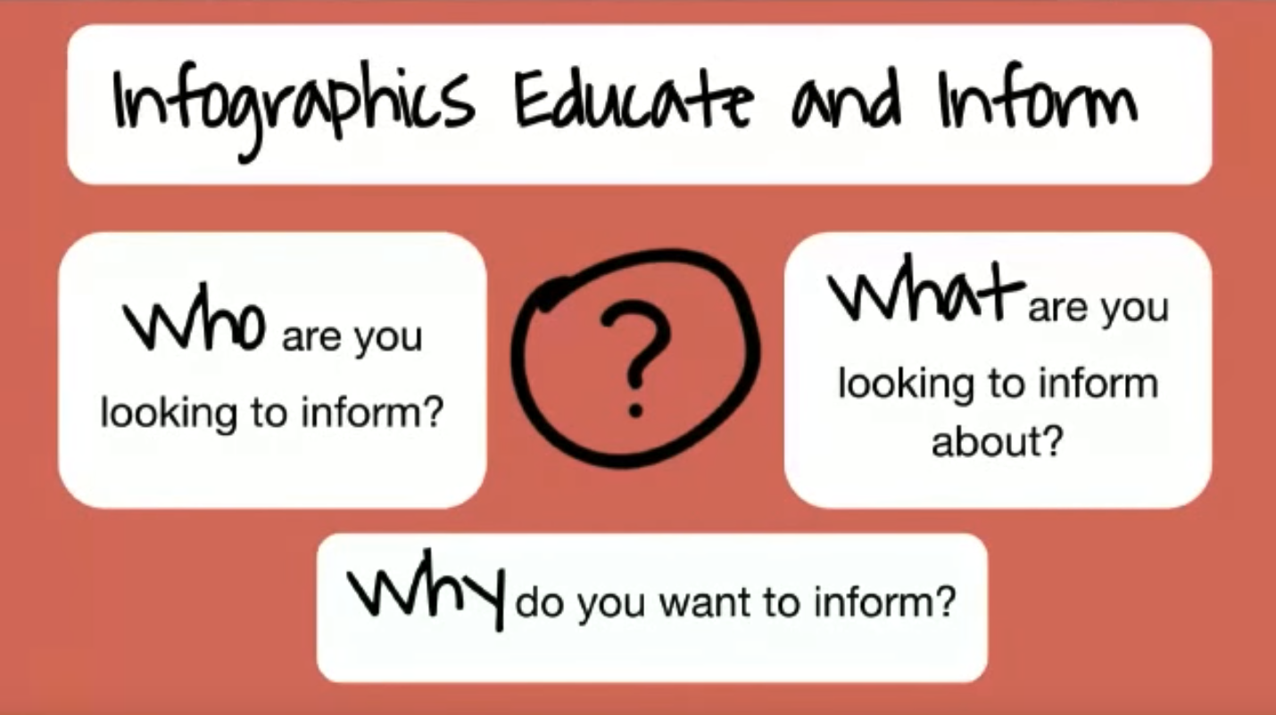
The next time you’re creating an infographic with your class or asking students to find data for their next presentation, create space to ask the really important questions:
From there, any infographic you create will serve its purpose: to share ideas in visual ways.
Final Thoughts
We at Easelly would like to thank Kristin Fontichiaro and Angie Oehrli for their time and insights. Their project at the University of Michigan, made possible in part by the Institute and Library Services RE-00-15-0113-15, continues through September 2017, with two books published with their project materials. They are also creating another virtual conference set for July 20-21, 2017, as well as continuing education video and curriculum for librarians and educators.
Oehrli, a Senior Associate Librarian at the University, closes with this thought: “We want people to know that there are data literacy strategies they can employ to better navigate the world around them.”
If you’d like to see more about their project, or attend their virtual conference in July, please visit their website.