A successful infographic is one that creates brand awareness, generates shares, brings visitors to your site, informs, or encourages people to purchase from you. Imagine the opportunity to generate all that action from one little piece of content!
Pinterest and infographics are a perfect match. An infographic on Pinterest can be interesting, useful, or entertaining – just what Pinners are looking for. Because of that, they may be shared like mad – often far more than your typical blog post image – and that is a great way to make sure people find your Pins in the smart feed.
What goes into a successful infographic on Pinterest
To find out, I looked at two indicators of infographic success:
- Popular infographics on Pinterest – Pins with a high repin count from a Pinterest search for “infographic.”
- BuzzSumo’s report on the infographics most often shared to Pinterest in the “marketing” category.
What follows are the elements of successful infographics with examples for each. Naturally, not all the top infographics contain every element, but they all include some of them. Adopt these when creating your own infographics and you’ll be amazed how far your content can go on Pinterest.
Element #1 – Usefulness
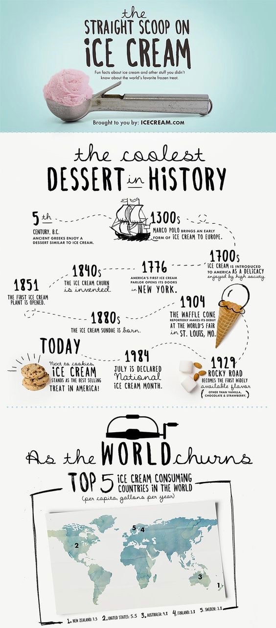
All successful content informs or entertains. To make your infographic on Pinterest useful, try teaching someone how to do something. Give them a history lesson. Point out the 21 benefits of owning a cat (as if we didn’t already know!).
Element #2 – Consistent Branding
If you pin a lot of infographics, you may have noticed that they are often the most saved, but not the most clicked Pins on your profile. People save them for future reference, perhaps not clicking when they first spot them – or ever. Because of that, you want to make sure the infographic on Pinterest is successful in another way – it needs to increase brand awareness of your product or service!
With that in mind, add your logo and/or your website to your infographics, and make sure to use your brand colors and fonts. Having a cohesive style for all your content will help keep you top of mind and make your work highly recognizable! And if your infographic takes off, the free exposure for your brand can generate meaningful results down the line.
That said, if website traffic is what you’re after, there is something you can do to get more clicks!
Element #3 – Strong Call to Action to Generate Traffic
Pinterest can be a powerful driver of website traffic, so unless your main goal is huge exposure for your brand and you don’t need website traffic, don’t give it all away. Include enough in your infographic to make it useful, but not completely satisfying. Give them a reason to click to see more – and call that out right in your Pin and description.
Don’t give it all away!
For instance, if your infographic on Pinterest is for your blog post “10 No-Fail Social Media Contest Ideas,” include five or six of the ideas on the infographic itself, and instruct Pinners (in the image and description) to click to see them all. This way your Pin is useful and worth saving, but you’ve teased them with great content and now they want more!
Element #4 – Three or Fewer Colors for More Saves
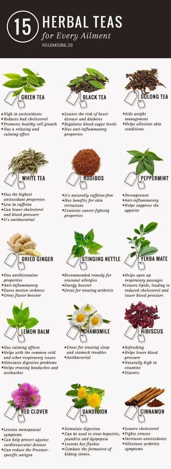
Most of the top infographics (but not all) have a fairly simple color palette. While warmer colors like red or orange typically do very well on Pinterest, you should use colors that are consistent with your brand. In fact, in terms of infographics, you’ll find many of the ones that surface time after time feature cooler colors.
Element #5 – It Goes with the Flow
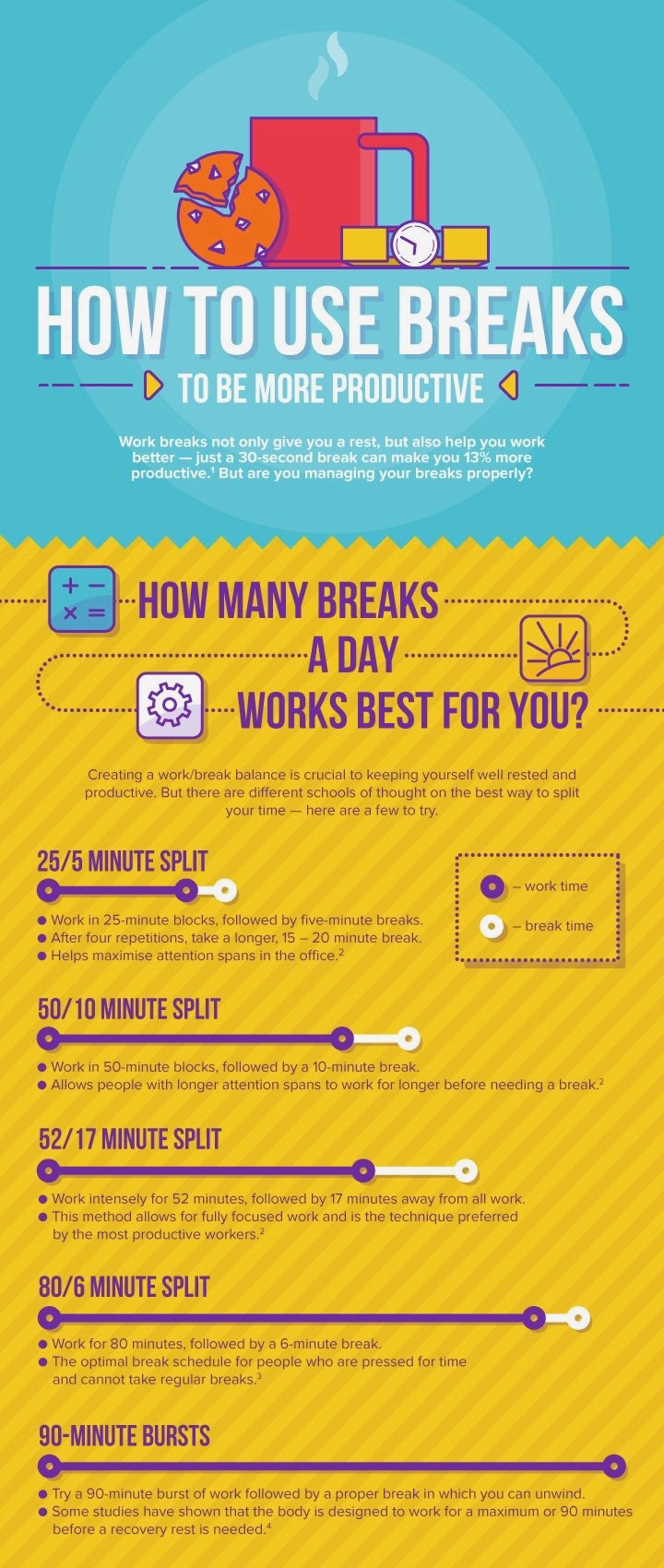
In the English-speaking world, we read top-to-bottom and left-to-right. Follow that flow to make digesting the information on your infographic easier.
Element #6 – Links to Back it Up
Next, including the website URL that includes the statistics you use in your infographic is a great way to add credibility to your infographic Pin. Give people the confidence to share your Pin. And don’t worry about it detracting from your visual – they can be in a small typeface as they don’t necessarily have to be legible on mobile.
See the Digital Roadmap image above – they list several sources at the bottom of their infographic to back up their data.
Element #7 – Legibility
Speaking of mobile, 90% of pinning activity takes place on mobile devices, so make sure that (at least) the main points of your infographic are easy to read even when they’re on a (very) small screen.
14.2K shares – And look – this is a buyable Pin!
Element #8 – Shareability
When you put the infographic in your blog post, make sure you also include the embed code if you want others to share it in their own blog posts. While this won’t necessarily make your infographic on Pinterest perform better, people will Pin those blog posts containing your infographic, which links to your site. In a roundabout way, you’re making your infographic more successful on Pinterest – even if it’s not your Pin or post! Also, when you create an infographic with Easel.ly, it creates the embed code for you! Just click “Share” and scroll down to “Embed Code.” Then, you can insert it into your HTML site page in your website management tool (WordPress, SquareSpace, etc.).
Element #9 – It Doesn’t Break the Bank
Finally, designing an infographic doesn’t have to take forever or cost a fortune. Easel.ly has a robust free plan, and the Pro plan, with more options for customization, costs just $36/year. Start with a template and just go for it! My most popular infographic on Pinterest was one I created in about 30 minutes. I’m constantly amazed at how often I see it in my OWN feed!
—
Alisa Meredith is the Content Marketing Manager at Tailwind, the premier Pinterest and Instagram scheduling and analytics tool. She is slightly obsessed with Pinterest, dogs, cats, and the beach near her home in Wilmington, North Carolina.


