If you run a small business or manage a larger organization’s content marketing, it’s important that everything you create and share always leads your audience back to your services, products, or message.
Infographics are an increasingly popular option for content marketing, as they allow a business to share information while also incorporating branding elements, such as fonts, colors, logos, and tone.
Plus you can share infographics virtually anywhere!
Even if you create the most amazing infographics, however, it won’t grow your marketing ROI unless people connect it with your brand.
Infographics can do a lot of the “work” for you, in terms of getting shared, attracting new visitors to your site, etc.
But you need to optimize your infographics to both share valuable information and make a connection in your audience’s mind: “This image is connected to this company so I can trust this information.”
That’s why keeping your infographic on brand is so important. It’s also very important that your message is genuine and reflects the tone of your business; going “off script” will confuse your audience and make them question your reliability.
That’s why creating an on-brand infographic is more than just using your logo and company colors. It’s about knowing your audience and evaluating all of your content to make sure it’s valuable.
7 tips to creating on-brand infographics
To create authentic, on-brand infographics, here are seven things to keep in mind during creation:
1. Figure out what you want people to remember
Don’t make the mistake of thinking any infographic is a great piece of content. You need to take the information you want to share and build a story around it:
- What do you want people to remember from your infographic?
- Why is it important for them to know this?
- How are you going to make the message visually impactful?
Before you start translating your business into visuals, figure out the conclusion you want your audience to make about your business, products, or services. Then carry that conclusion through all other infographics you create in the future. This creates brand identity and cohesive, authentic messaging.
2. Choose colors intentionally
Every designer does this in their own way, but here are some general tips to remember:
- 2 main colors are ideal, 4 colors total is an ideal max.
- Keep your branding colors or create a color scheme based on Color Theory.
- Retain plenty of white space.
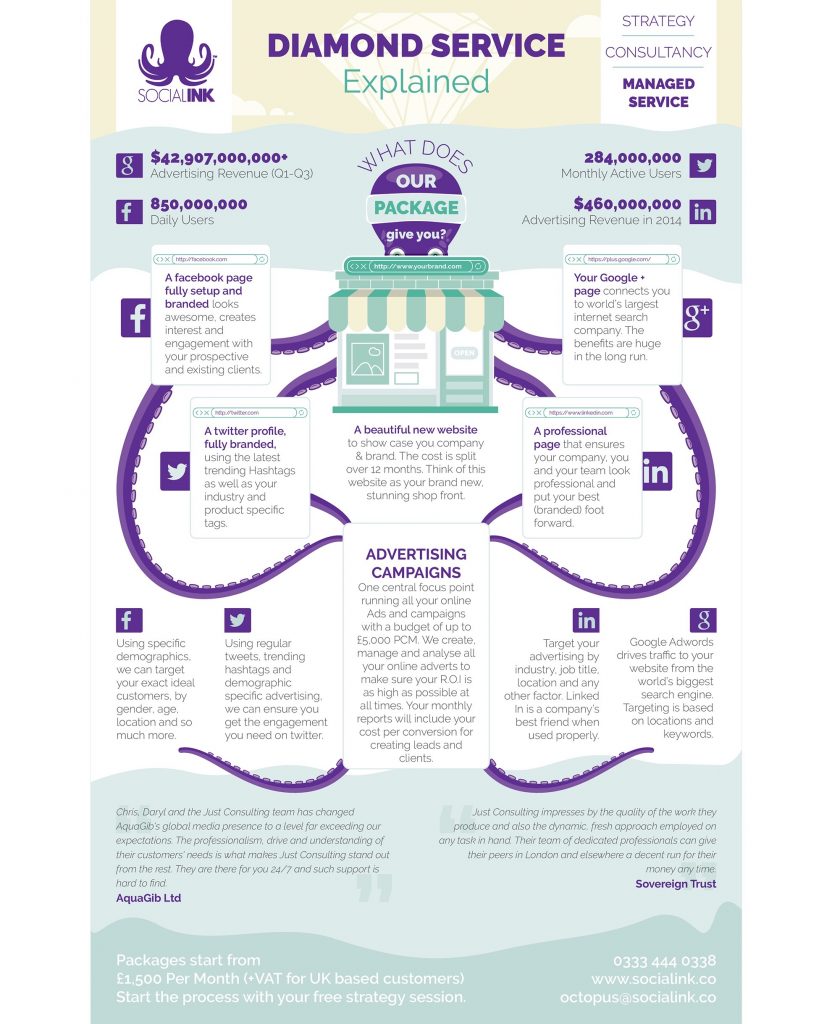
This image is a great use of just three colors, two main colors and a neutral hue. Info/brochure graphic by YaseenArt for SocialInk.
As you choose your color scheme:
- Think about your subject and your audience. Are you creating an image about green cleaning products? You might want to consider incorporating more green!
- Avoid creating too many infographics that don’t reflect your branding. Even if you have to use a different color palette for holidays or specific subjects, keep your fonts, general style, and logo/call-to-action.

Read more infographic color scheme tips here — 7 Quick Tips in Picking the Perfect Color Combination for Your Infographics
3. Build a visual structure
Make sure each piece of your infographic works towards together to communicate your message. We recommend keeping a general content block structure that you carry throughout your content marketing.
A special note about branding in your image: Your logo or company name shouldn’t be intrusive, but it should be clearly visible in the header or footer of the image to drive the brand message home. Not only do you want everyone to remember your name, but branding your infographic with your logo also ensures that it is a trusted piece of content from a reputable organization.
4. Turn text into graphics
Anytime you can transform dry data and the text version of your brand’s value proposition into graphics, do it! Making your information visual grabs your viewers’ attention and holds on. It also communicates your brand message clearly.
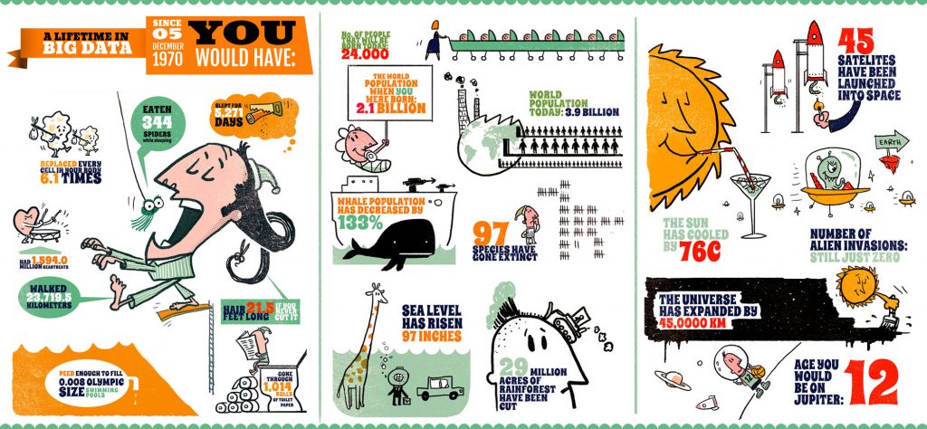
This infographic masterfully turns text into images and grabs the attention immediately. Infographic by Pinch Studio.
5. Write branded copy
With an infographic, you need to make a big punch with less space – and with much less writing. Trim everything you can; your goal is less text but great, shareable sound bites. Think of this as your visual elevator pitch about the brand. Use your company’s buzzwords or marketing language so that the reader is always connected back to your company.
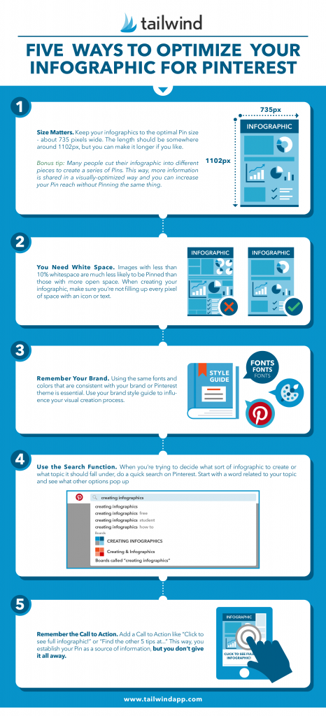
See how Tailwind uses their branding style in this infographic
6. Make your infographic authentic
The best infographics convey both data and authenticity; your audience has standards and they expect content that is valuable and also reflects their tastes. Show people what you’re saying in a way that conjures up a reaction – emotional responses lead to more effective conversions! Remember, every piece of authentic content will be tied back to your logo and brand colors – and therefore your business.
See more infographics on our Pinterest page!
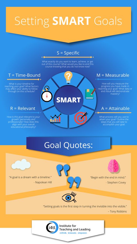
This image persuades its audience to commit to their goals, while subtly drawing attention to their business at the bottom
7. Include a call to action
Remember, always include a call to action in your infographic. To figure out what call to action you want to include, consider:
- Why are you creating it?
- What do you want people who read it to do?
- What does that have to do with your brand?
A few options for calls to action include asking people to call you for a consultation, check out your website, or even a suggestion to “Share this image on social media.”
The takeaway
Infographics tell a story with visuals and small amounts of text. Be picky with the visual elements and copy that you include on these images; high standards will create a more cohesive brand and authentic tone.
This way, people will be able to recognize your content at a glance, and they’ll know that the information will be valuable.
Get started with your brand infographics by customizing infographic templates or by working with our infographic designers.
