Losing the audience’s attention is one of the most painful challenges for anyone making a presentation.
Halfway through your presentation, you notice that a couple of audience members are getting restless. The people at the back seem bored as they look down on their phones, and one of them just yawned (ugh!).
You start to feel that you failed to engage your audience. You wonder if you’re the problem. Are you a boring presenter? Perhaps you’re stuffing too much information in your slides.
Master audience engagement with these presentation best practices
From engaging product demos to presentation decks that stand out, read on for 20 valuable tips to keep your audience excited to hear more from you.
What makes a great presentation?
Before you get started, it pays to know what makes an excellent presentation.
1. It informs your audience by providing reliable information.
People want to be informed. They want to learn something new. For this reason, you should look for reputable links. The information should be as recent as possible, and at least less than a year old.
Your research work doesn’t need to be from online sources. You could also cite printed sources from the library. Double-check all of your sources and make sure they have substantial research and statistics to back them up.
2. It persuades your audience to take action.
A presentation should be persuasive. This is especially true for business presentations and product demos. You might also want to appeal to your readers through emotions.
3. It educates your audience and empowers them to make informed decisions.
Presentations are, by nature, educational. You might be introducing your audience to a new idea, product, or service.
4. It instructs your audience in a clear, compelling way.
A presentation should be instructional. Organize your presentation as clear and concise as possible, so your audience will be able to digest your information more effectively.
5. It inspires your audience by being memorable.
A good presentation motivates an audience to act on things that they’ve been meaning to do after hearing you speak or present.
20 best pactices for visually-appealing, convincing presentations
With all that in mind, here’s a list of useful best practices and tips for presentations that stick.
1. Know your target audience.
Your target audience is the demographic that you’re aiming to convince, educate, or inspire with your presentation. This crucial step helps you craft a presentation that resonates with your intended audience.
For instance, if you’d like to educate teens, create a presentation that appeals to their age group. Make your presentation more upbeat, and use pop culture references and images that they can relate to.
On the other hand, if your target audience spans middle-aged professionals, your presentation should be straight-to-the-point and based on facts. These professionals are typically results-oriented, and they want to get to the heart of the matter right away.
By and large, getting to know your target audience enables you to create a presentation without wasting time on uninterested demographics.
2. Create an outline.
Your next step is to create an outline of your presentation. It will help ensure order in your presentation and present facts and sources as effectively and efficiently possible.
It’ll also help if you assign a subtopic for each slide. Let’s say your main topic is the American Civil War. The war lasted roughly four years, and if you delve into it without any organizational structure, your audience will end up confused. Sort your slides according to year and the important events that took place. The same applies to any topic.
3. Start with a memorable introduction.
Opening a presentation with “My name is .. ” or “I’m here to talk about..” are less likely to make your presentation memorable and engaging to your audience.
So how do you keep everyone glued to your presentation with a powerful, memorable opener?
Share an anecdote, ask an intriguing question, or get people’s energy up with a short activity.
Next, make your opening slides as eye-catching as possible. In your opening slide, use bold fonts. Add visuals like gifs or an animated infographic.
Finally, provide an overview of your presentation in the introduction slide. An overview that meets your audience’s expectations of your presentation helps keep an audience absorbed and attentive from start to finish.
4. Eliminate clutter in your slides.
Avoid overcrowding your slides with images or graphics. Although it’s fine to use visuals to complement your slides, the keyword here is “complement.”
Too many photos will make your slides look cramped. Take a minimalist approach to your slides. For images and graphics, use them sparingly and thoughtfully.
Don’t be afraid of white space in your slides. Consider readability first, visual appeal second.
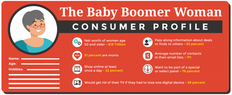
5. Use pictograms.
Lengthy presentations could get boring in the long run. So if you want to keep your audience’s attention, you will need to make your presentation attractive and easier to understand.
Enter pictograms!
Pictograms express information, ideas, or messages through images, signs, or symbols. Also, they can help simplify complicated concepts.
6. Be thoughtful of your color scheme.
Your choice of colors can have an impact on your audience’s mood and perception of your presentation. It may not be evident at first glance, but your presentation colors can draw a particular set of feelings from your audience. Orange looks more carefree than beige, right?
Here are some quick tips to help you pick the right color combination for your presentation:
- Choose a color scheme that matches your presentation’s theme. For example, if you’re about to present a serious topic, consider somber, dignified colors like white, black, or brown. But if you want your presentation to be more upbeat, use lighter hues like yellow and orange.
- Use your brand colors to raise brand awareness and recognition.
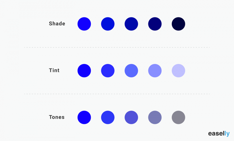
- Stick to 2-3 colors. Joint research by Adobe and the University of Toronto revealed that most people prefer a combination of 2-3 colors. A good rule of thumb is not to use more than four colors. When using more than 3-4 colors, go for shades, tones, and tints of your original colors like the example below.
7. Focus your audience’s attention using data visualization.
Presenting statistics and percentages in writing can be a challenge to use in your presentation. For this reason, consider data visualization.
For example, graphs and charts are often used to highlight comparisons in data. You can also use them to inform your audience of a specific data point.
It’s worth noting that a poorly-designed graph or chart could ruin your presentation if proven false or shabbily done. Make sure that your data are correct, and your diagrams or charts are correctly labeled. Don’t just use pie charts because they look hip and smart. You have to learn how to choose the right chart or graph to visualize your data.
8. Use presentation templates.
Templates often take a bad rap because they’re perceived as limiting, sapping one of creative freedom. However, templates shouldn’t be perceived this way.
Think of templates as frameworks or a set of building blocks that you can tinker with as you create your presentation. Without a templated structure, you’ll likely waste a lot of time and resources making your presentation from scratch.
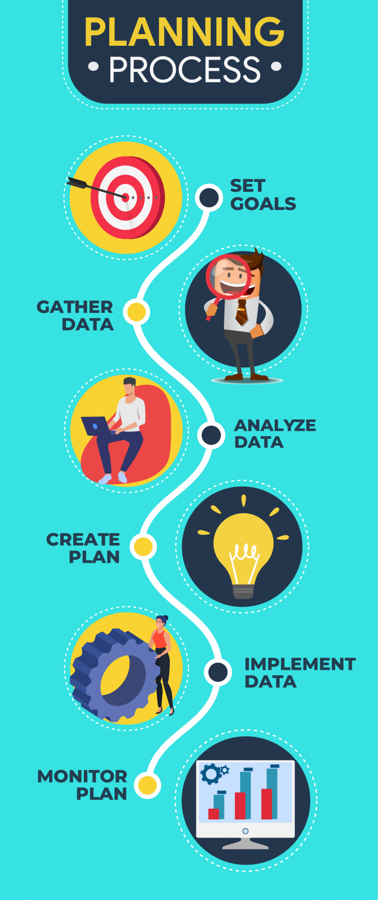
For example, use infographic templates as a way to make your presentation more engaging (minus the time-consuming task of making a presentation from scratch. The process infographic template below is perfect if you’re explaining a process in one of your presentations.
9. Try the duotone effect in your presentations.
The duotone effect is the use of two contrasting colors to create dramatic, visually pleasing results. Thus the name duotone.
This design style is gaining popularity with designers and non-designers alike. Learn more from this quick duotone tutorial via Adobe.
10. Show, don’t tell.
Stories are a powerful medium to get your audience to sit up and listen to you. For this reason, aim to “show” rather than “tell” your audience about a topic, insight, or idea.
For example, don’t just state facts or figures about the dangers of not investing in their retirement. Instead, share the story of someone you know who failed to plan for their retirement, nudging your audience towards making their own conclusions or insights.
Don’t bombard your audience with too much information all at once. Avoid jargon or complex concepts without sharing a story that’ll resonate with them. With compelling storytelling, you can create anticipation and then slowly build up to your key points.
11. Incorporate infographics into your presentation.
Infographics are valuable presentation tools because they combine visuals and text. As a result, you can communicate with impact.
Furthermore, infographics make your presentation more memorable. How?
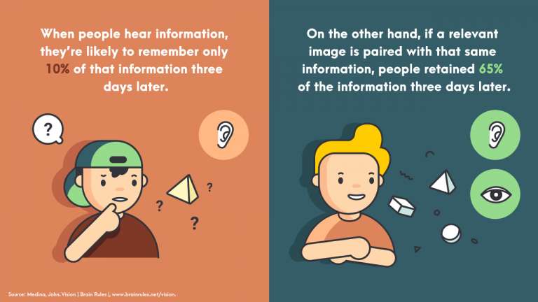
A relevant image paired with informative text helps people retain 65 percent of the information three days later — a stark contrast to presenting text-only content where someone’s likely to remember only 10 percent of the information.
Here are a few guides and tutorials when creating infographics for your next presentation:
- Guide to Making Infographics from Scratch (guide)
- 5 Ways to Use Call to Action in Your Infographic to Boost Audience Engagement (video)
- How to Write Sharp, Compelling Infographic Copy (guide)
Easelly Pro Tip: Divide long infographics into smaller segments. Add an infographic section for each presentation slide. If you’d like to raise the bar further for your presentation, try animated infographics to make your slides come to life.
12. Avoid using bullet points.
Bullet points are great tools to emphasize tips, features, or steps in lists. However, it’s best to avoid them in presentations because they don’t help your audience retain information.
Research even supports this recommendation. In 2014, the International Journal of Business Communication published the results of their research — The Use of Visualization in the Communication of Business Strategies: An Experimental Evaluation.
The researchers wanted to learn whether the use of visuals is superior to text (a bulleted list to be specific) in communicating the strategy of the financial services branch of an international car manufacturer.
The researchers concluded the following:
“Subjects who were exposed to a graphic representation of the strategy paid significantly more attention to, agreed more with, and better recalled the strategy than did subjects who saw a (textually identical) bulleted list version.”
Instead of using bullet points, consider using icons or visuals.
Take a look at the example below. Which do you think will likely get the audience’s attention and be more memorable after the presentation?
13. Choose fonts that are easier to read.
The quality of your font could affect your audience’s reaction to your presentation. Don’t just use the first standard font that pops up in your presentation editor.
Your font should match the mood and intent of your presentation. If you want your presentation to appear casual, choose a font that gives off a similar feeling.
14. Use contrast in your presentation.
Check for contrast between your texts and presentation background to ensure readability. Make it a point to distinguish one from the other.
It’s also worth noting that you are going to show your presentation to a group of people. Depending on the seating arrangement, viewers at the back may find it hard to read your presentation. Make sure that your fonts are of the appropriate size. That way, none of your audience members will have to struggle reading your slides.
15. Consider gifs and memes

Gifs and memes are popular media tools for a good reason. You could incorporate them into your presentation, and they could add a sense of humor to your topic or pitch.
When using gifs and memes, avoid those that could be misinterpreted as politically incorrect or culturally insensitive.
16. Create a consistent look and feel in your slides.
Choose a theme for your presentation templates, and stick with it ’til the end.
This doesn’t mean that you should be boring or dull with your presentation. You can add images and infographics, but there should be a sense of consistency in your slides.
Consistency leads to familiarity, which in turn encourages learning and engagement.
17. Ask intriguing questions.
Asking intriguing questions enables you to draw your audience’s attention and highlight key points at the same time.
For example, you are conducting a presentation on the Roman empire. You want to get your audience’s attention, so you raise questions such as what they know about the Roman empire, and how did the Roman empire impact modern society?
The audience may or may not get the right answers, but they will most likely try their best to answer your questions. The resulting exchange of ideas will make your presentation more spontaneous and engaging.
18. Limit to one visual per slide.
Using too many visuals at once will make your presentation appear cluttered. Limit to one visual per slide to help your audience engage more with your text and information.
19. Embrace white space.
White space, also known as negative space, is the space between the lines of texts and visuals in your presentation. It doesn’t have to be white as it can also take the color of your presentation’s background. Think of white space as “empty space”.
It helps improves readability and ensures that your graphics and texts are clear and legible in your presentation.
20. End your presentation with an excellent call-to-action.
Call-to-action statements are an integral part of any presentation. They compel your audience to take action, and it makes your presentation more interactive.
Here’s a short video explaining how to use call-to-action in infographics (the same principles apply for presentations!):
Say you’re designing a presentation for a new gym you’re managing. You want people to try out the gym and the services you offer. You could incorporate the call to action at the end of your presentation.
“See you at the gym next week?” or “Level up in the New Year by signing up for our free gym membership for a month!” are good call-to-action statements that you can use.
Ready to start creating your presentation?
We’ve got your back if you need help with your visuals and infographics for your next presentation.
Use our simple infographic maker tool or hire one of our infographic design pros for custom infographics and animated infographics.
Here’s to a stellar presentation – we’re rooting for you!

