Have you ever wondered why the McDonald’s golden arches are so hard to resist even when you’re not hungry, or why you’re drawn to that pair of shoes you don’t need? That’s the power of the subconscious mind at play. More specifically, visual elements influencing our shopping behavior.
Humans are visual creatures. We process 90% of information through our eyes and do it 60,000 times faster than we do text. Because we’re perceptive, specific colors, shapes, and patterns trigger an emotional response. It’s no surprise, then, that digital marketers use these insights to tap into our subconscious and influence what we buy.
What are these subliminal cues and tricks advertisers use to get us to open our wallets? And more importantly, how can your business use the same visual elements and techniques to boost your sales? Let’s explore further.
How the Subconscious Mind Works
Picture this: You’re scrolling through your Facebook feed when you see an ad for the newly-opened restaurant downtown. The image shows a big, colorful, and delicious-looking pizza. Your stomach starts growling, and before you know it, you’re ordering a pie.
This is how the subconscious mind works. When a certain stimuli (in this case, the image of the pizza) is presented, it immediately creates a desire for that thing. And in no time, you’re satisfying that want (in this case, by ordering the pizza).
Now, you might be thinking, “I would never fall for something like that!” But the thing is, we’re all susceptible to subconscious purchasing decisions. In fact, according to Harvard professor Gerald Zaltman, 95% of all spending is made subconsciously. This means that even if we think we’re entirely logical in our buying habits, there’s a good chance that our subconscious is actually calling the shots.
The Visual Elements at Play
Now that we understand how the subconscious mind works, let’s look at some visual elements that influence our purchasing behavior.
Visual Element #1: Color
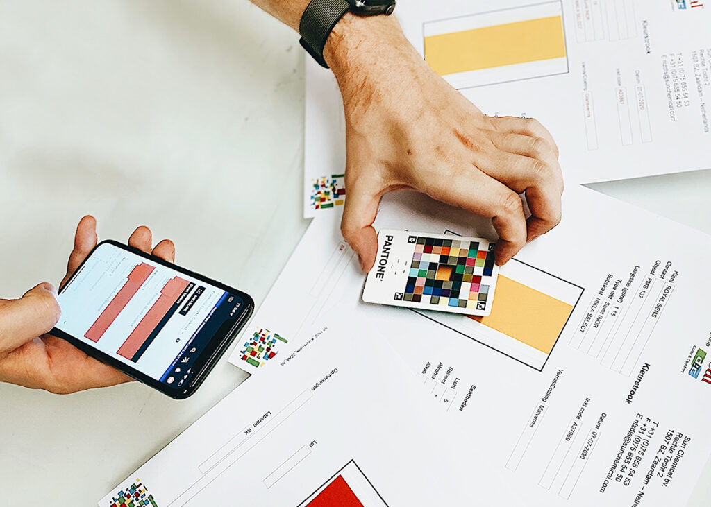
Color is one of the first things we notice about an object. This is why online marketers use it to activate an emotional response. For example, red is often associated with feelings of urgency, which is why it’s often used in clearance sales. On the other hand, blue is calming and creates a sense of trust.

Keep in mind that buyers can make rapid decisions about a product in 90 seconds and 90% of them will do so solely based on shades. So if you’re looking to create an online shopping experience that’s optimized for conversion, think about the psychology of the colors you’re using.
📌 Application: Avoid using more than three hues in your design (as this can be overwhelming for visitors) and leverage complementary shades to create visual interest. For example, you could pair a rich navy blue with a crisp white.
💡 Utilize a tool like Adobe Color to create a color scheme for your website that’s based on the emotion you want to evoke.
Visual Element #2: Shape
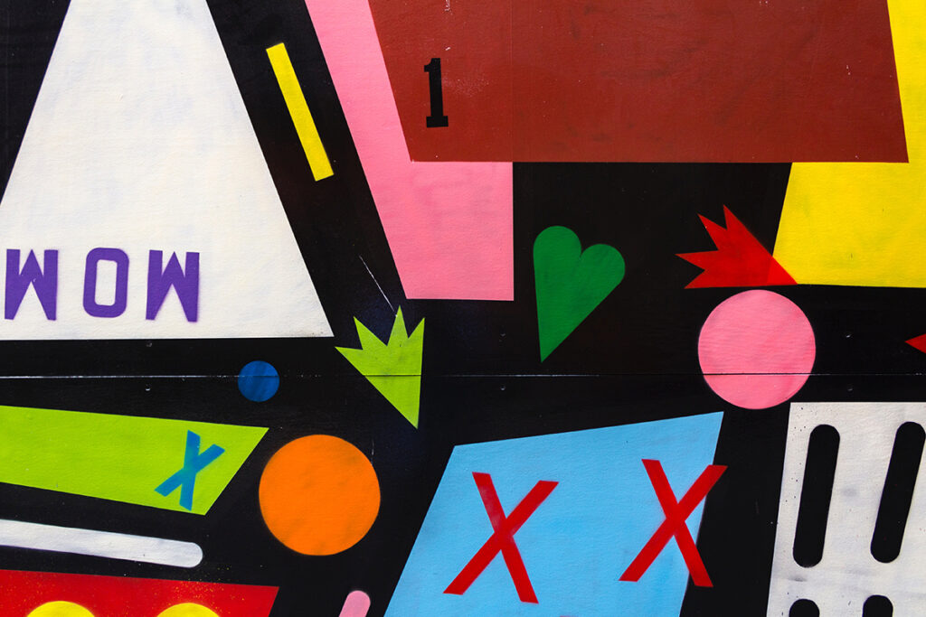
The shape of a product can make it appear more or less appealing. For instance, American psychologist and marketing expert Ernest Ditcher says consumers associate more rounded shapes (such as circles) with sweet-tasting meals and beverages. In contrast, bitter-tasting foods and drinks were associated with more angular shapes (such as stars and triangles).

Meanwhile, shapes in the world of online shopping play a role in consumers’ decision-making process:
- While only 20% read a web page, over 92% review every image
- 63% claim good photos are more important than product descriptions
- 67% admit pictures are essential when making purchasing decisions
📌 Application: Package your products in an elongated container for increased volume perception. When designing your website or app, use images and graphics that are circular or have curved edges for a more subconscious appeal.
💡 Use high-quality images and videos to show your products from multiple angles.
Visual Element #3: Layout and Spacing
Those retail stores that have you meandering through aisles and aisles of products before you can get to the cash register? They’re doing it on purpose. By controlling the layout of the store, they can control how much time you spend in it and, as a result, how much money you spend.

The same goes for online shopping. Top Design Firms’ report claims that 50% of customers believe website design is vital to a company’s overall brand. The more strategic, organized, and appealing your website is, the longer people will stay on it and the more likely they are to make a purchase.
📌 Application: Keep things clean and easy to navigate. Outline your website so people know where they’re going and what they’re looking for. If you want to get fancy, use heat mapping tools to see where people spend the most time on your website and adjust accordingly.
💡Guide visitors’ eyes to the most critical parts of your website by using whitespace to draw attention to a call-to-action button or contrasting colors to make it stand out.
Visual Element #4: Typography
Did you know that only 16% of consumers read word-for-word? The rest of us skim. This means that as a marketer or designer, you need to make sure your message is clear and easy to read.

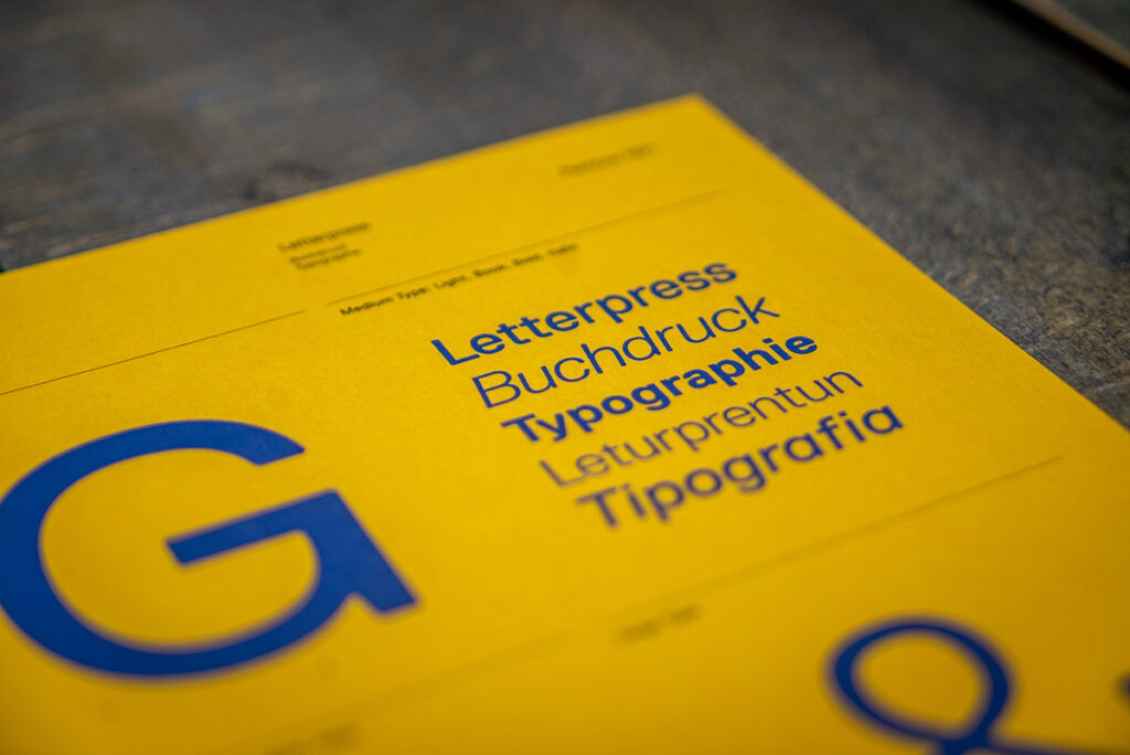
One way to do this is through typography. The way you format your text can influence how easy it’s digested. For example, utilizing headlines and subheadings breaks up blocks of text and makes it easier to scan. On the other hand, using larger font sizes make your content more scannable.
📌 Application: Play with fonts to promote readability. Bullet points are also great for breaking up text and highlighting key points.
💡 Use fonts like Montserrat, Roboto, and Open Sans, which were designed for the web and are easy to read on a screen.
Final Thoughts
The next time you’re designing an online shopping experience, keep the power of the subconscious mind in check. By understanding how it works, you can use visual design elements to influence shoppers’ behavior and drive them towards an action.
